I seek enjoyment in transforming creative ideas into
meaningful and extraordinarily noticeable brands.

GreenProTeam: brand identity & packaging

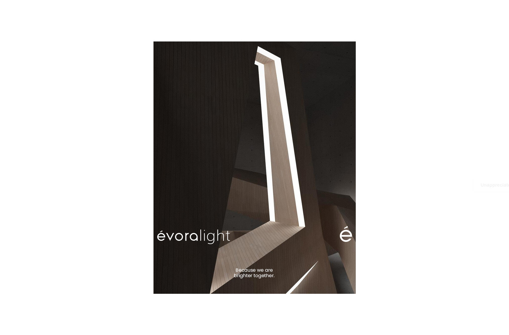
évoralight: Modern lighting solutions branding

empire: Dispensary franchise branding

Ronchesel Canastra • Luxurious coffee brand & package

cellx® • packaging

I seek enjoyment in transforming creative ideas into
meaningful and extraordinarily noticeable brands.
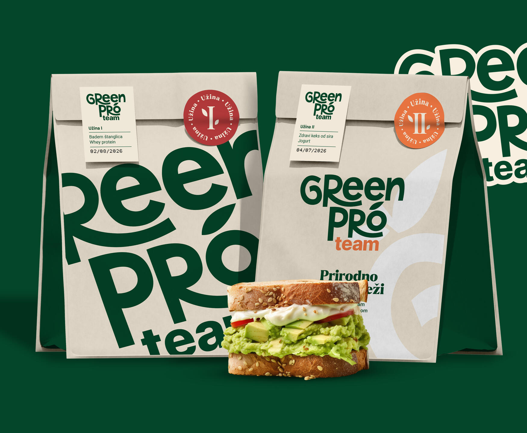
Green Pro Team
Visual Identity / Design Strategy / Package Design
Case Study Overview
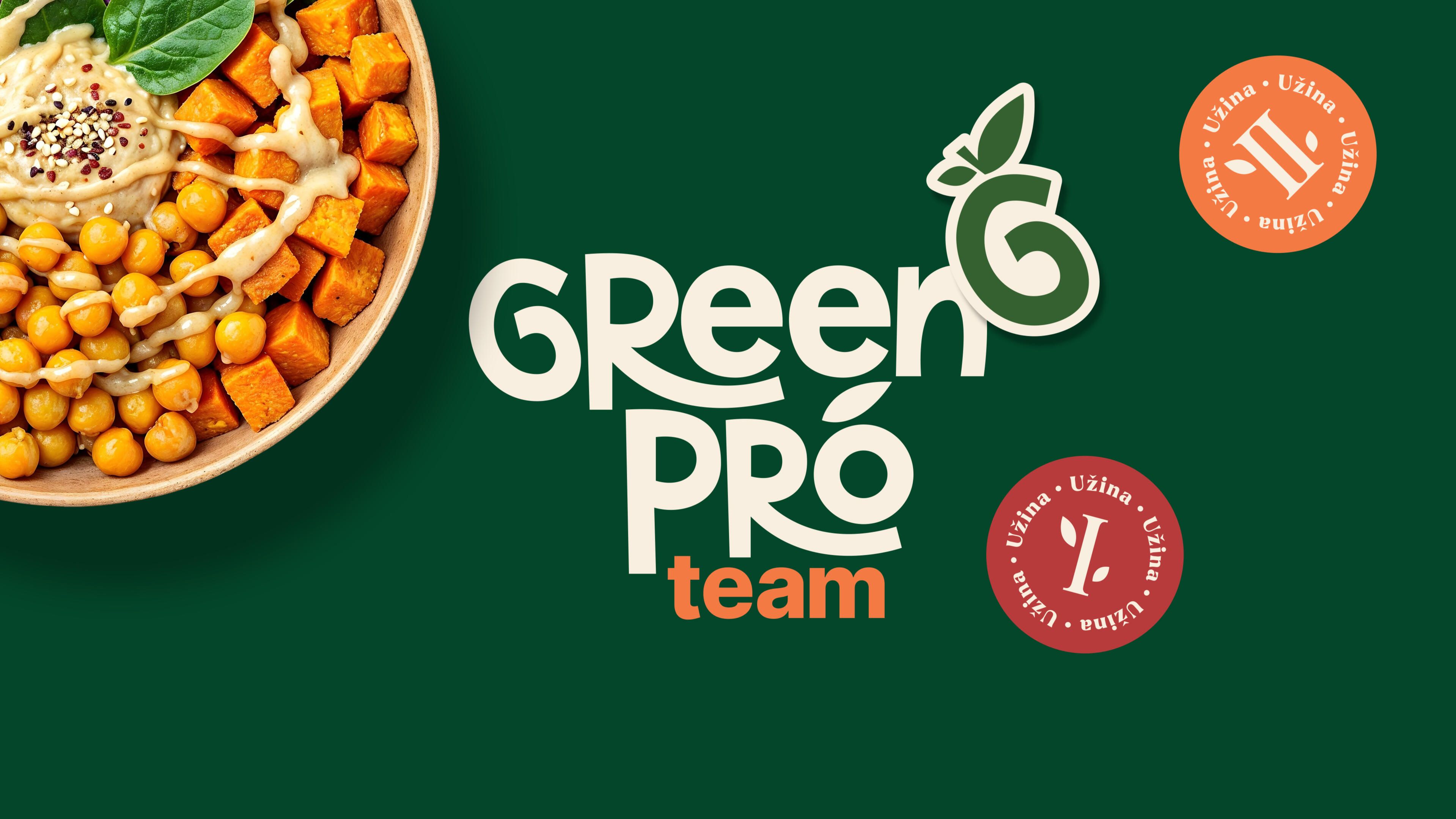
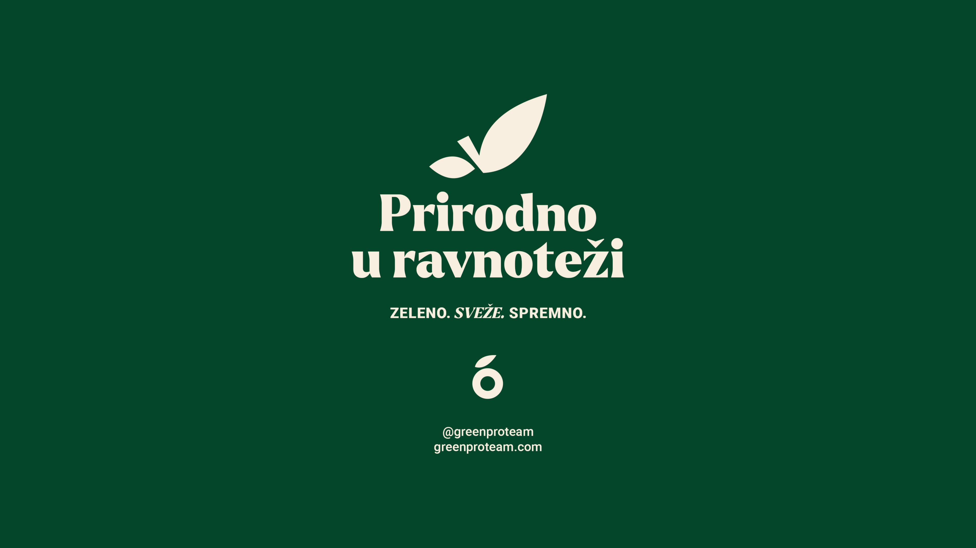
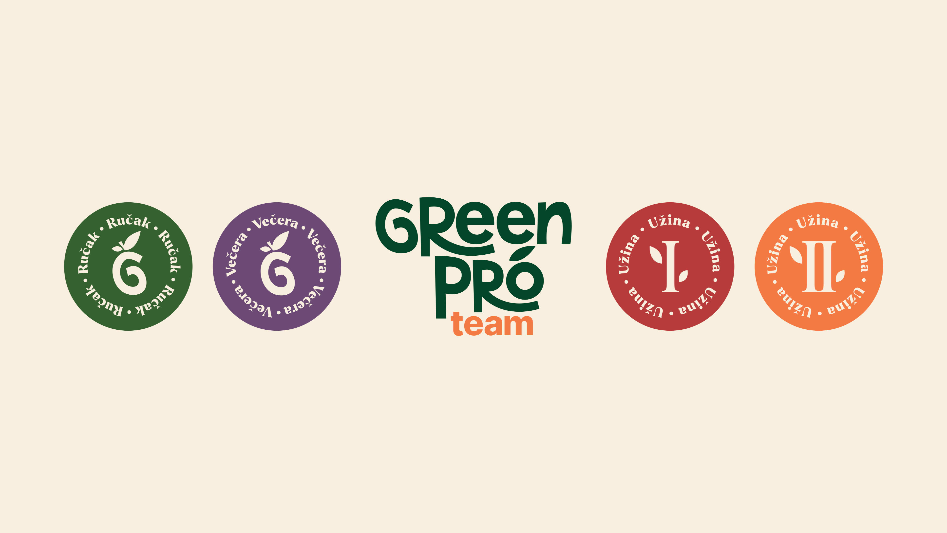
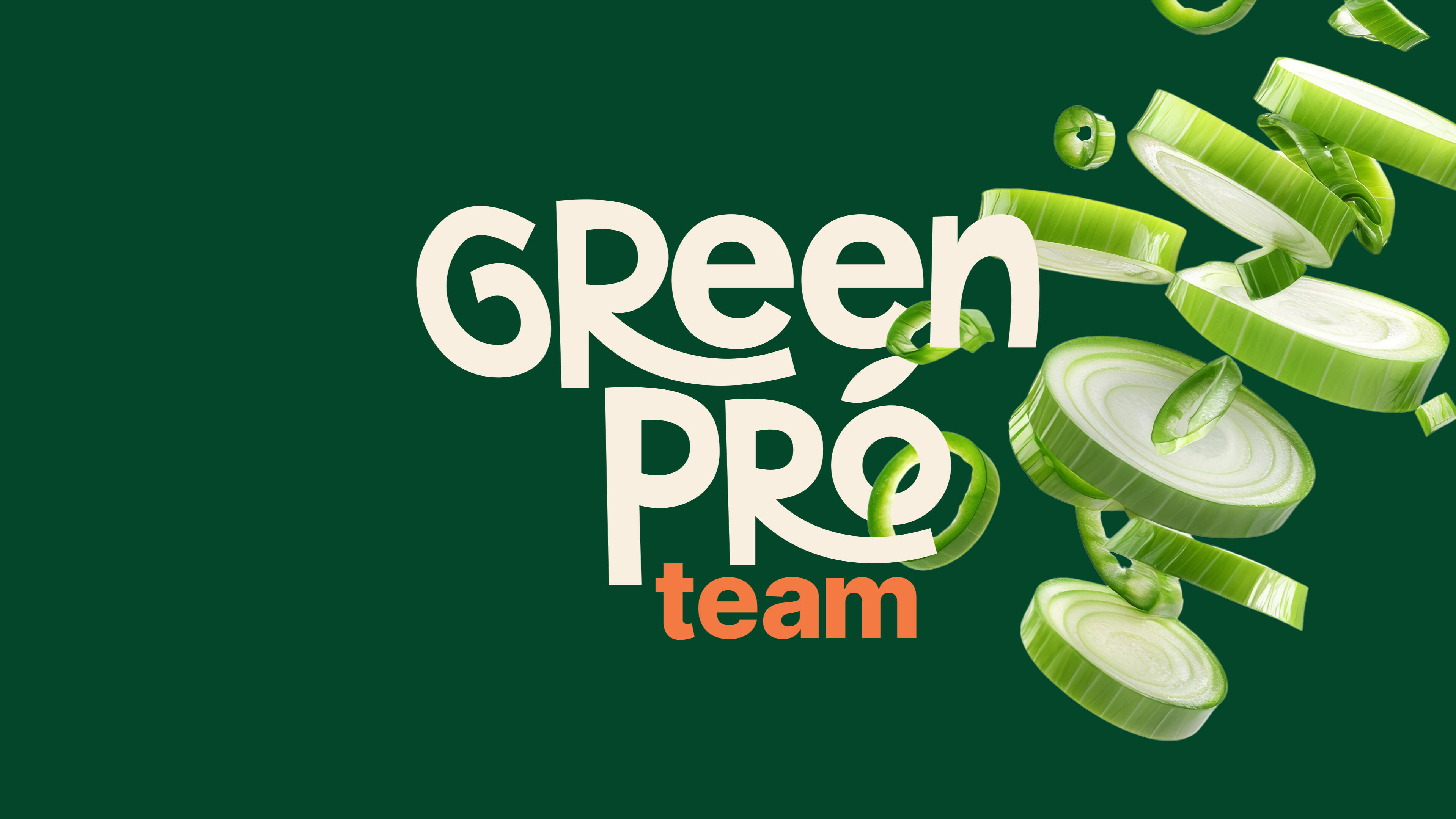
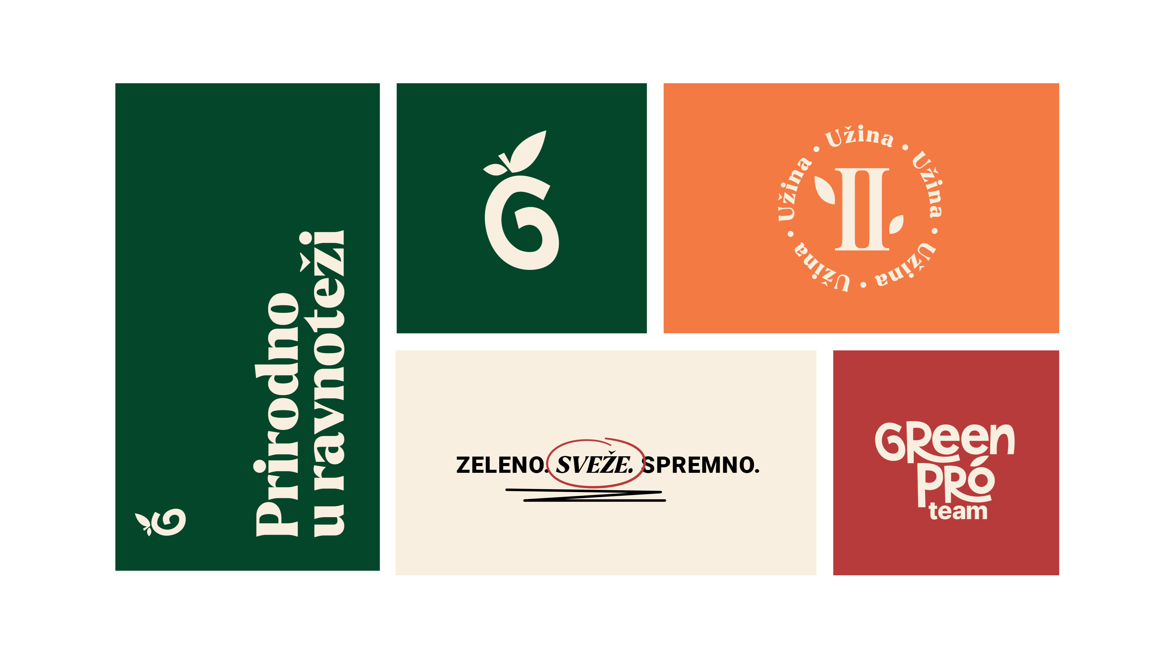
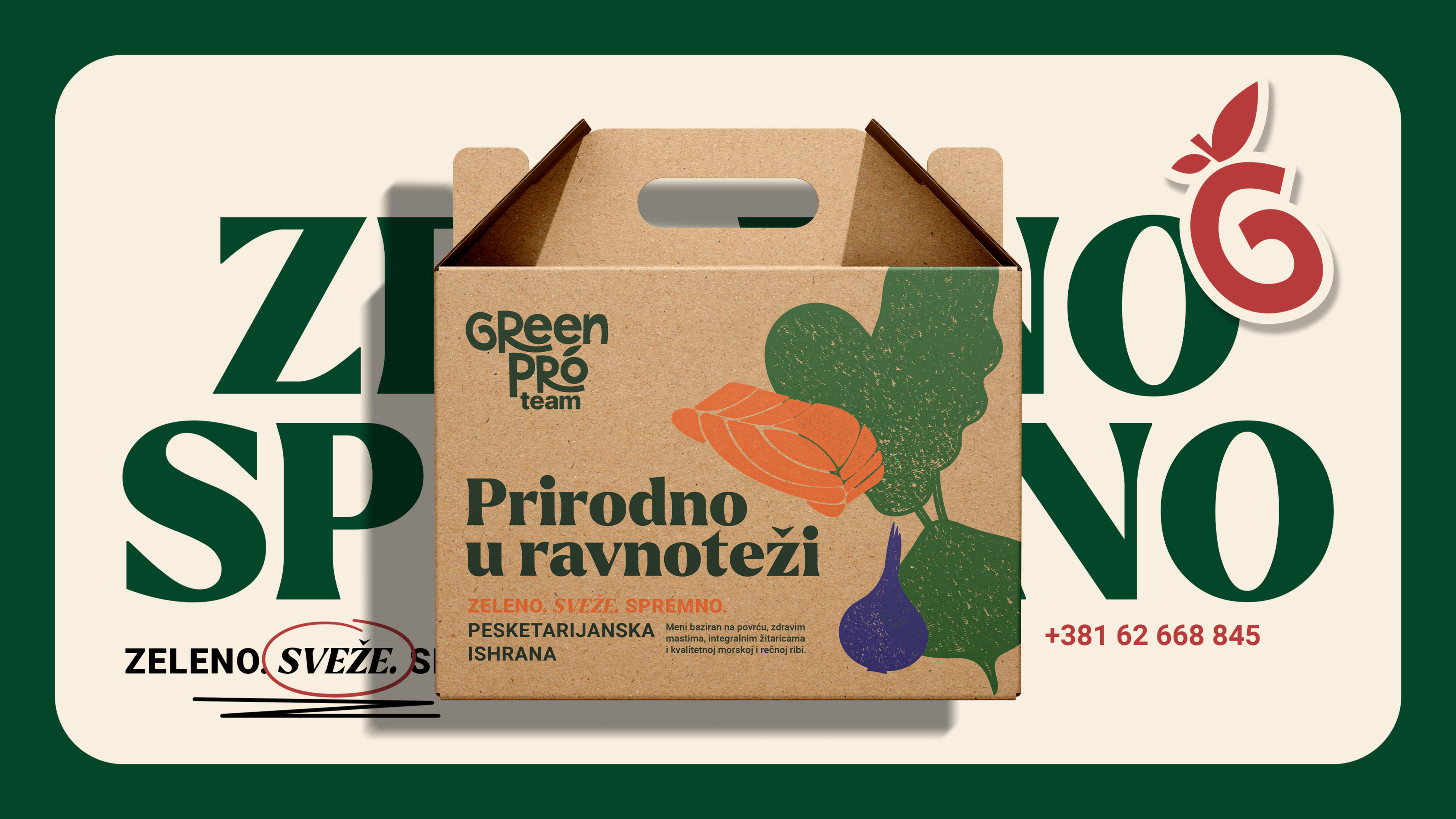
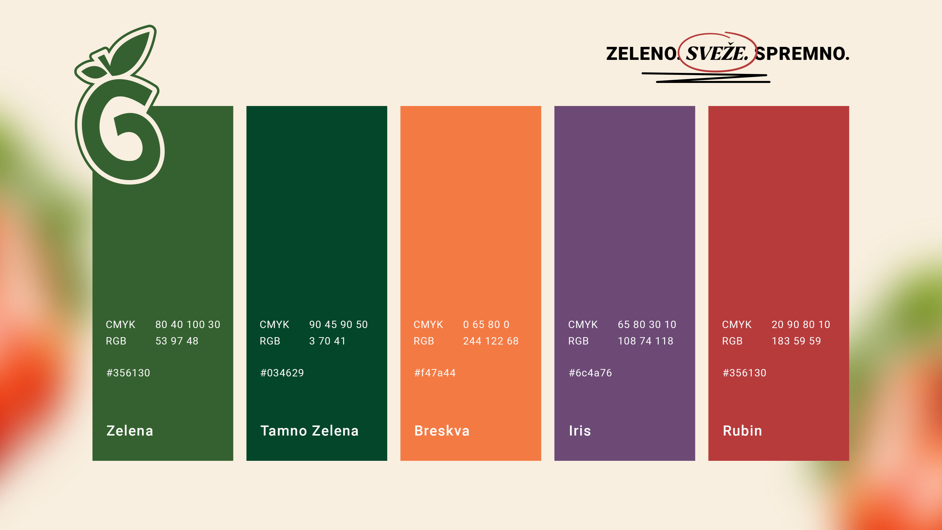
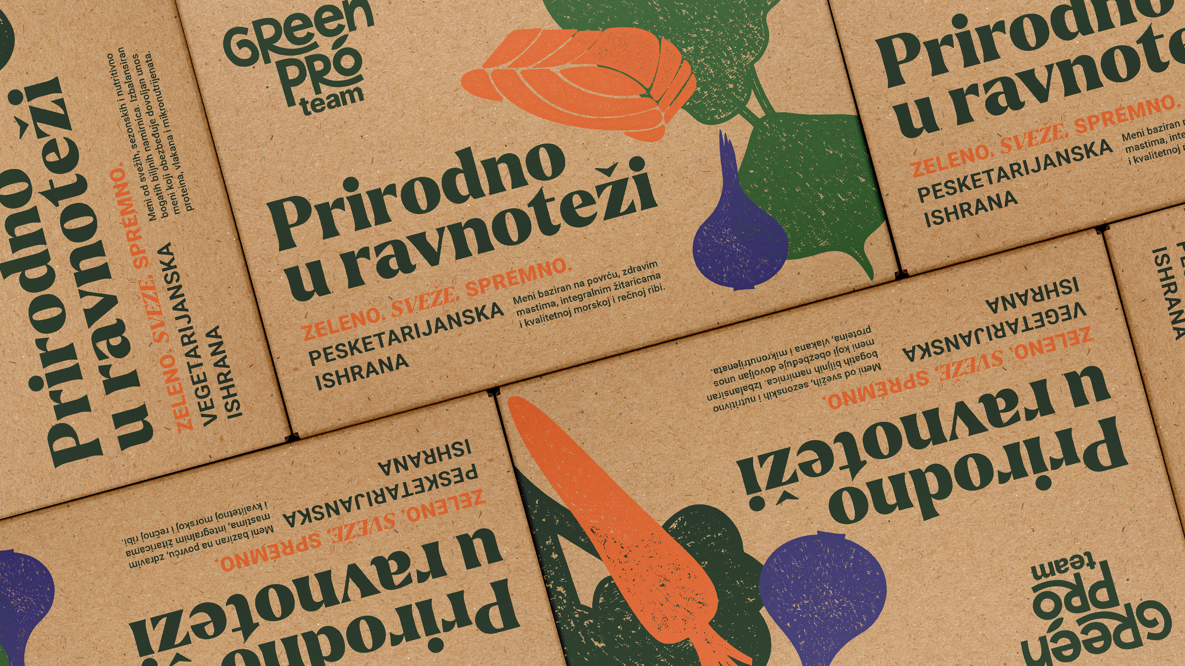
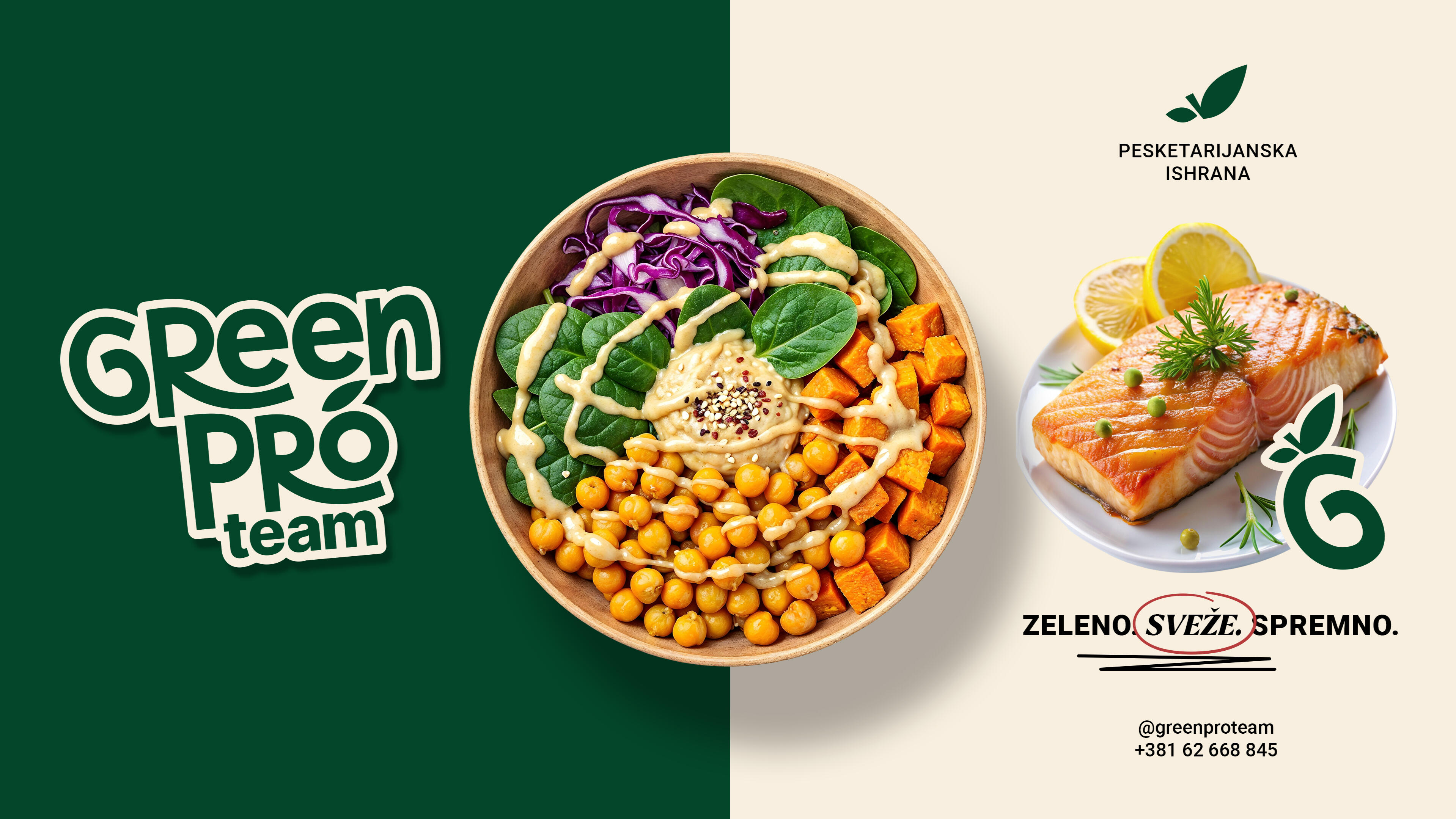
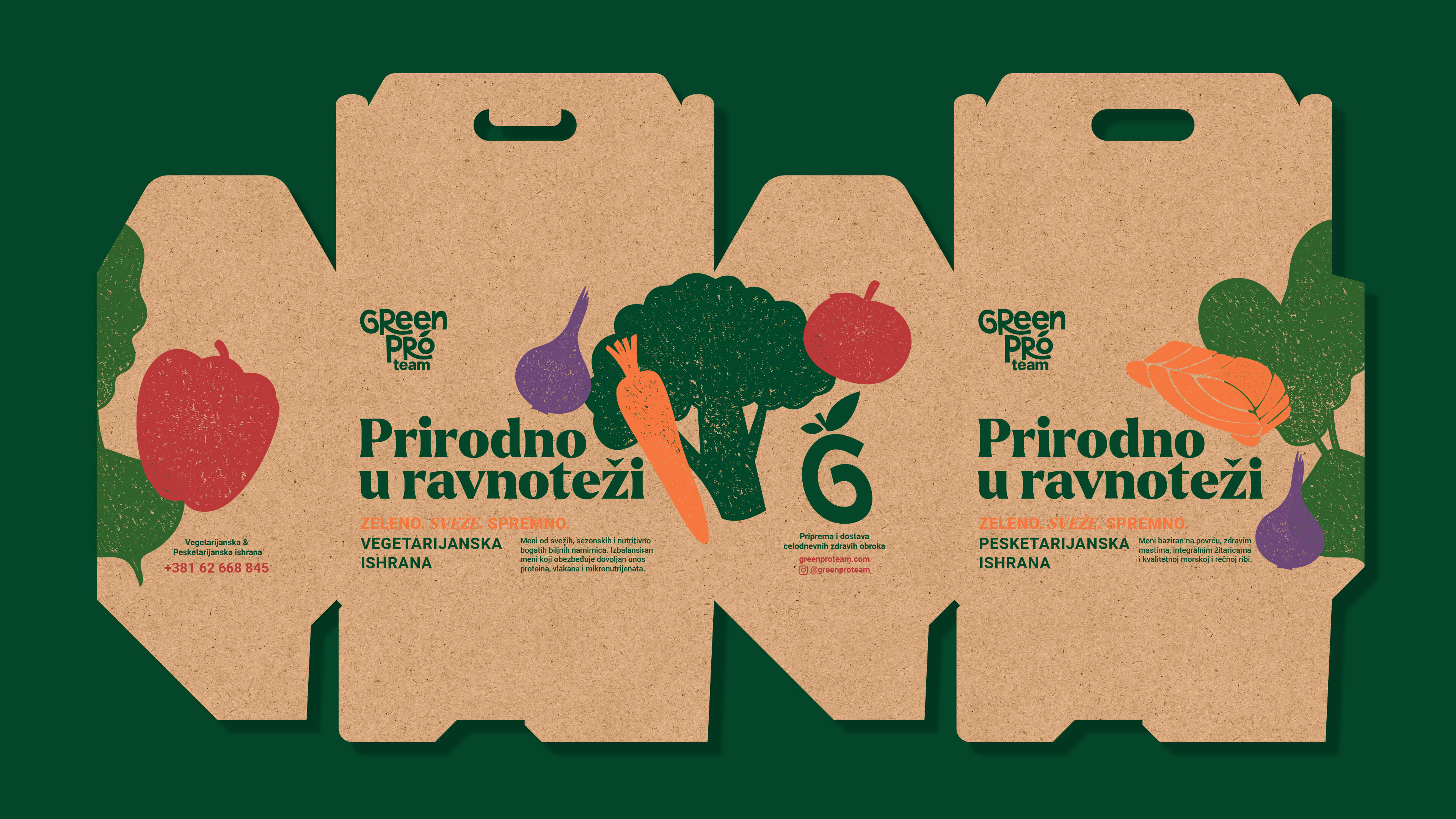
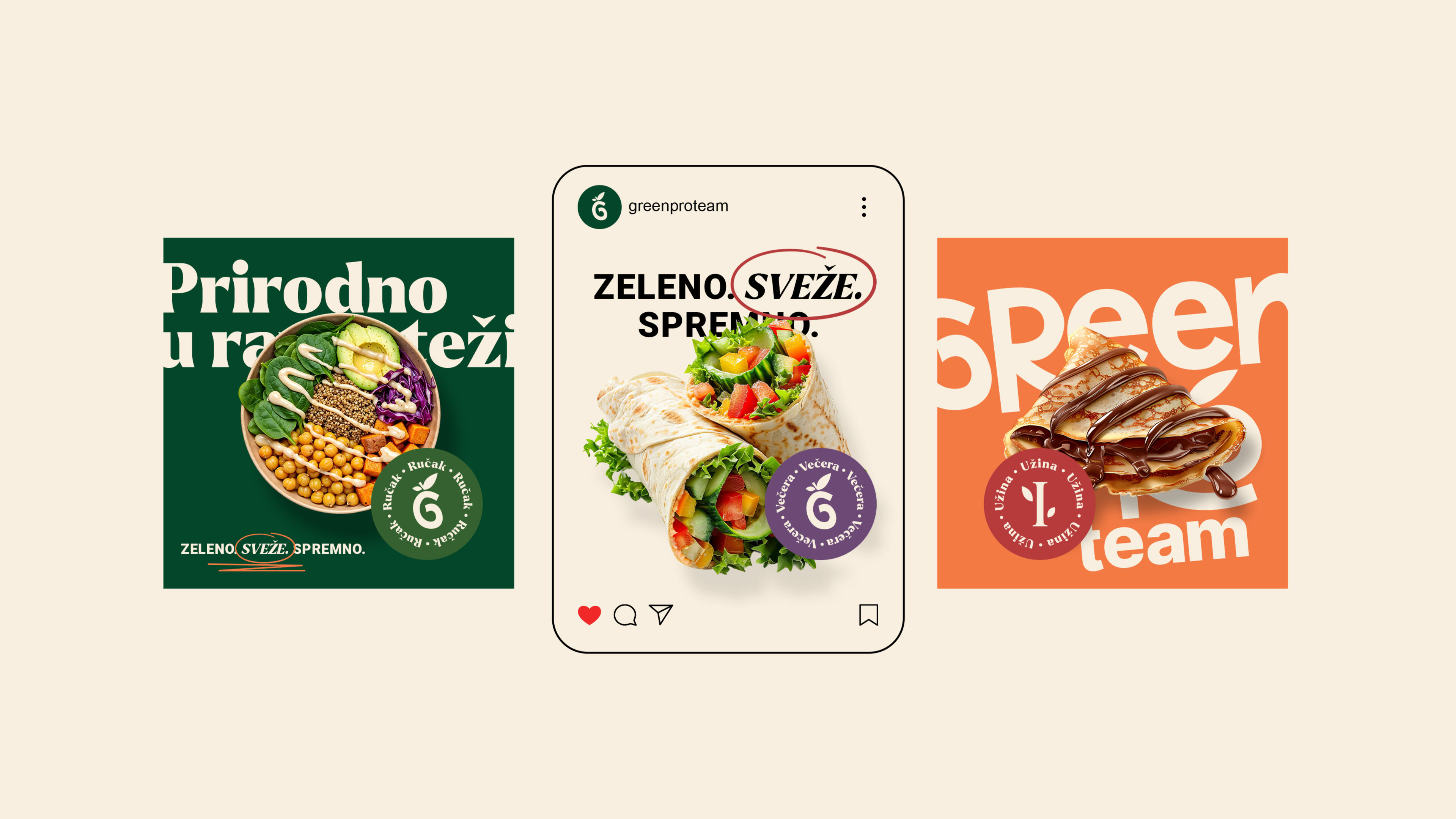
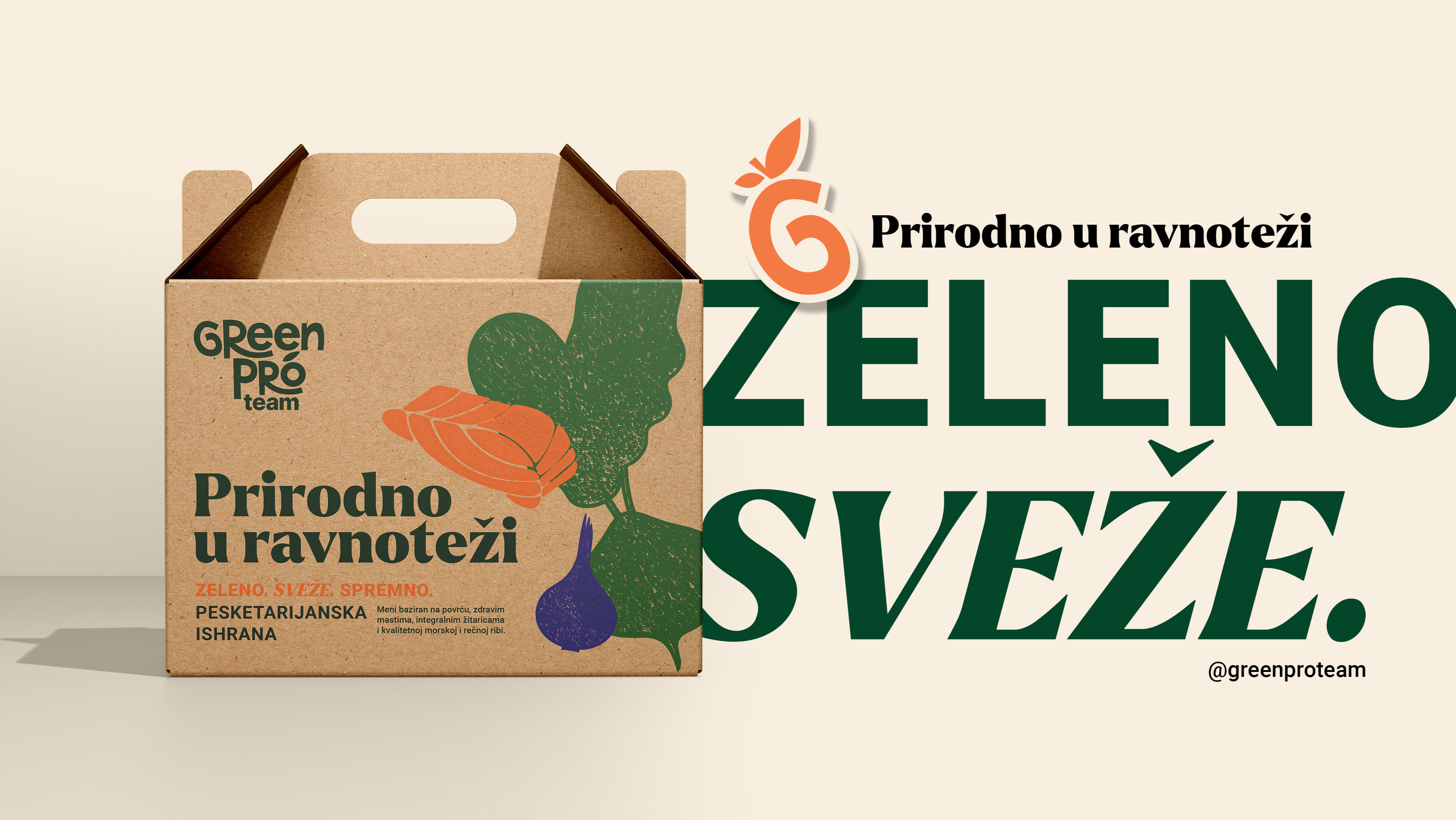
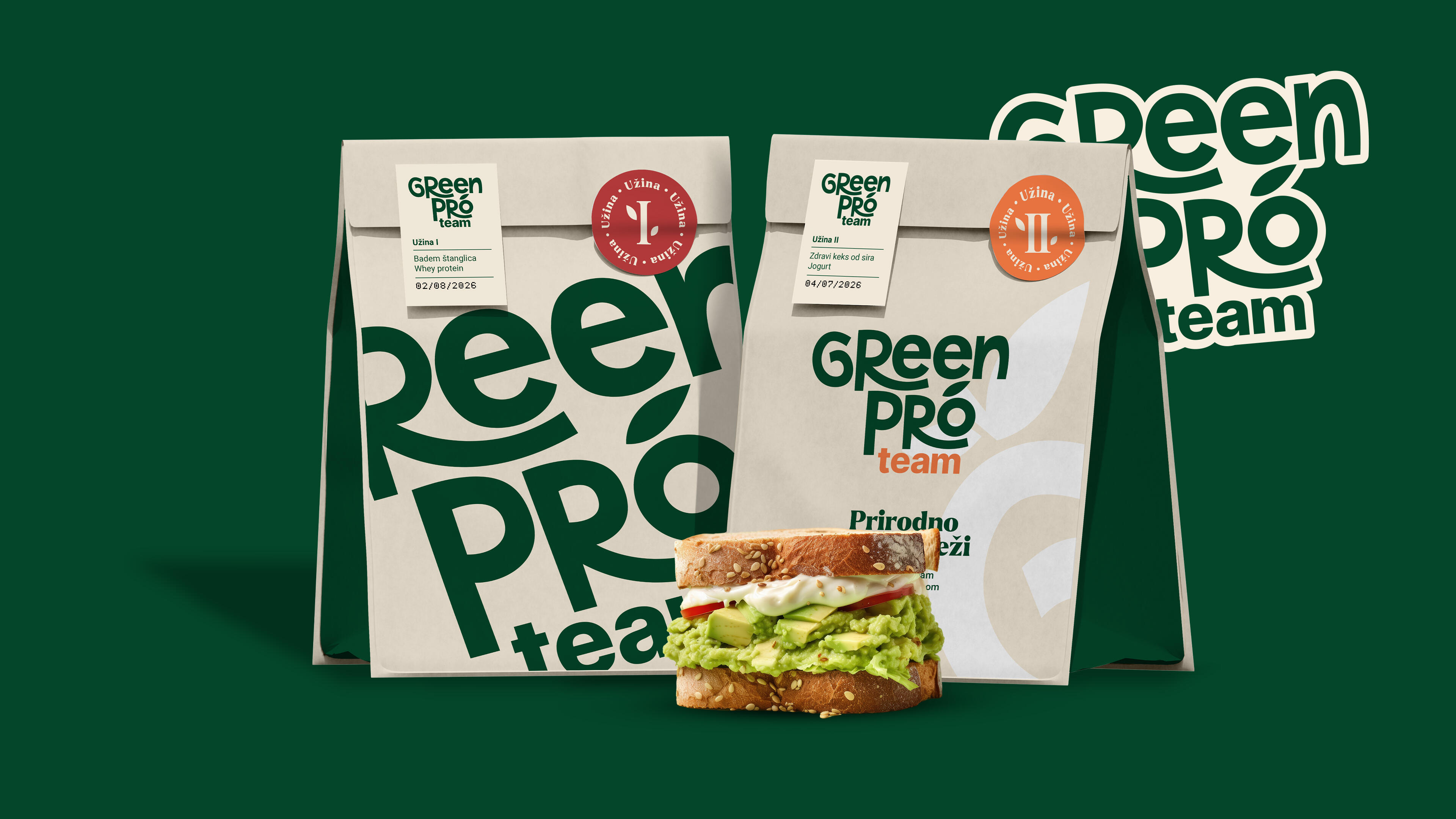
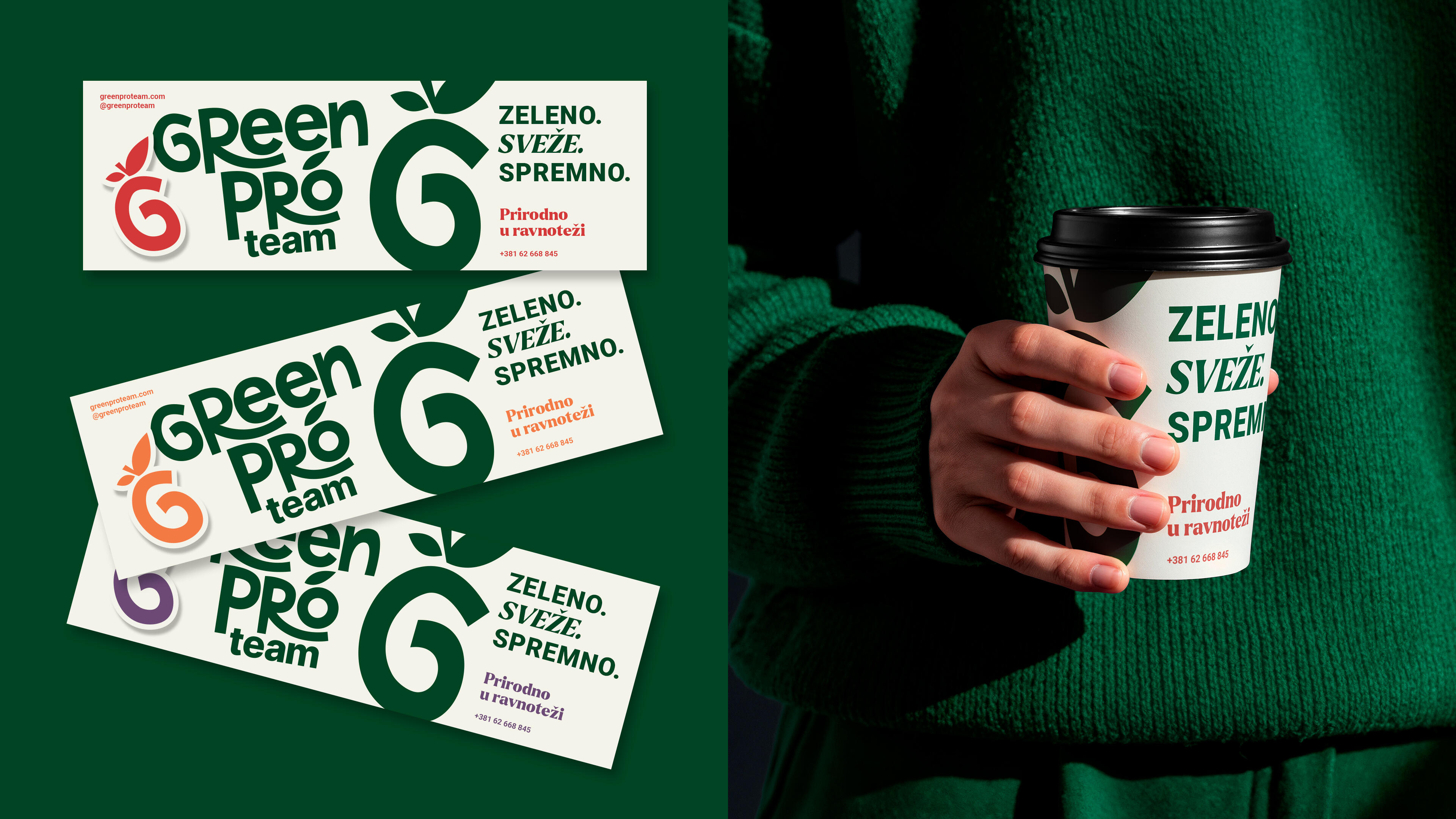
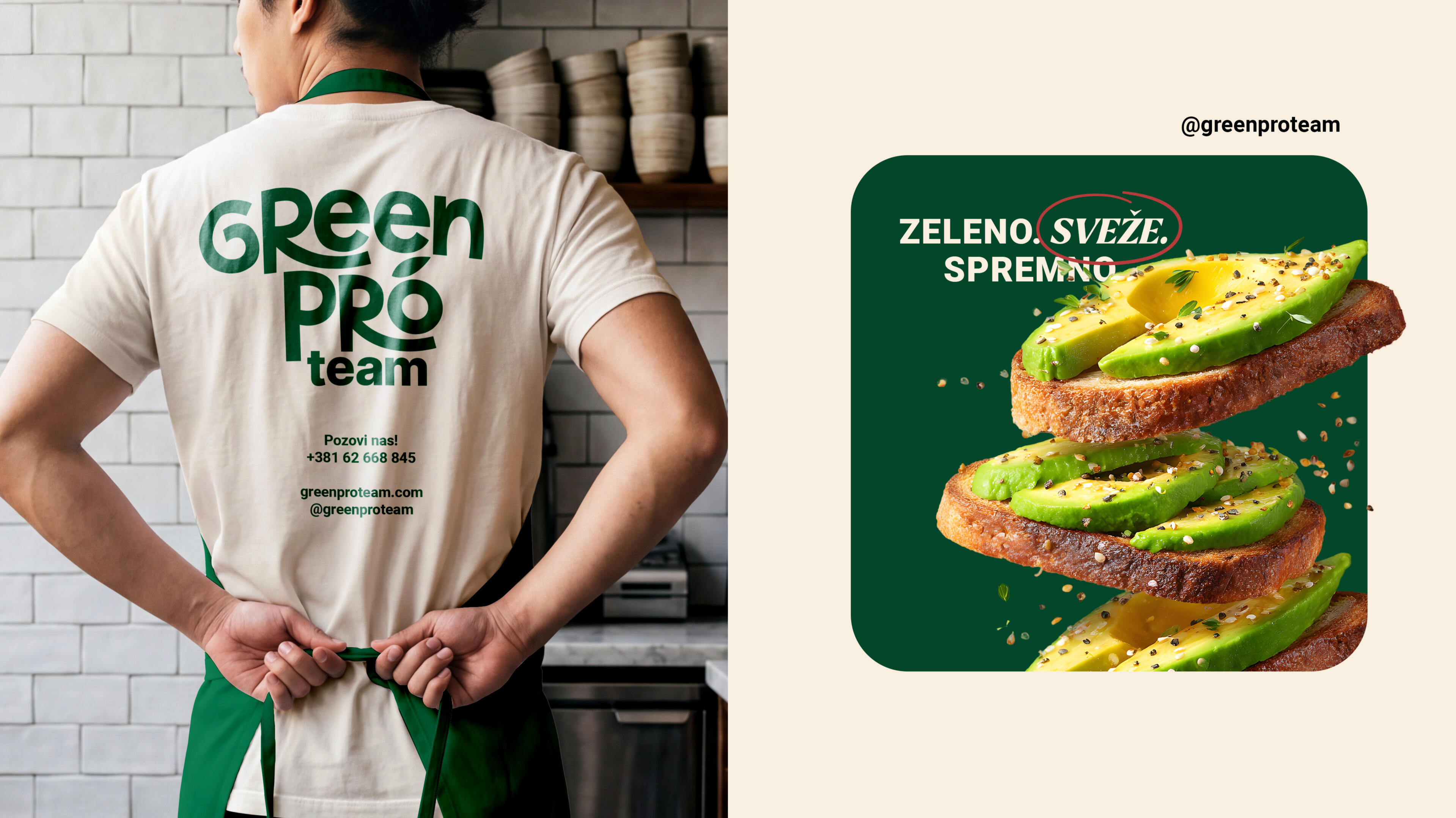
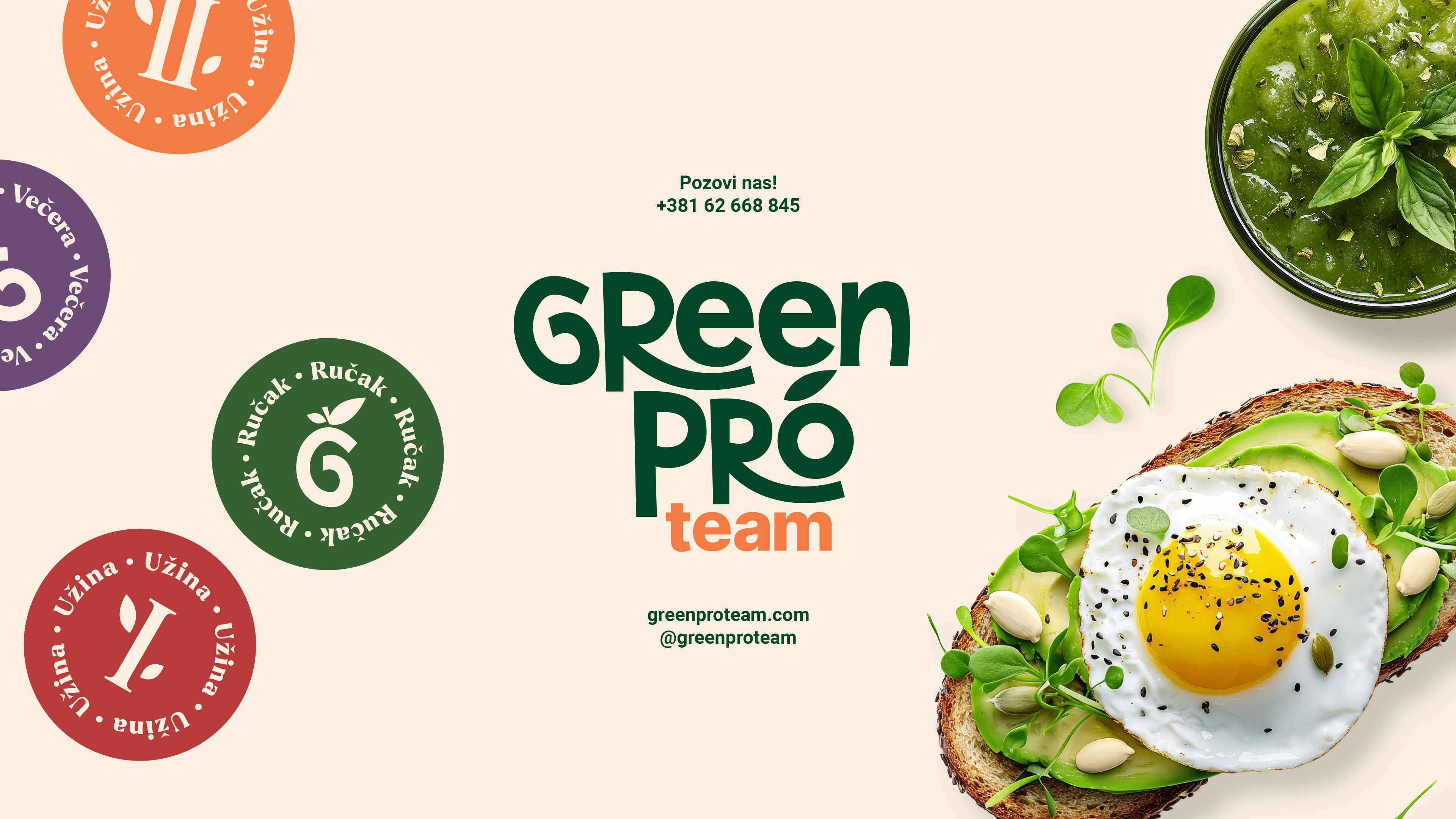
Green Pro Team is a healthy meal delivery service dedicated to bringing nutritious, chef-crafted meals directly to its customers' doorsteps. Every ingredient is carefully selected. From vibrant seasonal vegetables to premium ocean fish. Thoughtfully prepared, packaged, and organized to make healthy eating both effortless and enjoyable.The ChallengeThe identity was built around the idea of translating the nutritional value and freshness of every meal into a visual language that reflects the brand's philosophy. Rather than simply communicating health, the branding celebrates the care, craftsmanship, and the organic origin of their ingredients in every stage of the process.The SolutionThe logotype features custom hand-drawn lettering with a simplified, organic stroke that emphasizes the artisanal nature of the business, where every meal is hand-prepared with genuine care. A subtle leaf integrated into the final letter reinforces the brand's commitment to fresh, wholesome, and plant-forward ingredients without overwhelming the visual identity. For applications requiring a standalone symbol, the letter G is paired with a branch and leaf to form a stylized tomato—one of the kitchen's most essential ingredients and a universal symbol of fresh, home-style cooking.The delivery packaging extends the identity beyond the logo, transforming every order into a tangible brand experience. Designed to reflect the freshness and authenticity of the meals inside, the box reassures customers that the same level of dedication invested in preparing each dish continues through delivery. Intricate illustrations, inspired by 19th-century engraving and traditional printmaking techniques, pay homage to craftsmanship and reinforce the brand's handcrafted approach.The ImpactIn an industry increasingly defined by predictable minimalism, Green Pro Team embraces warmth, character, and personality. The result is a vibrant identity that stands apart from the competition, turning every delivery into an experience that customers can anticipate with excitement—both figuratively and literally.
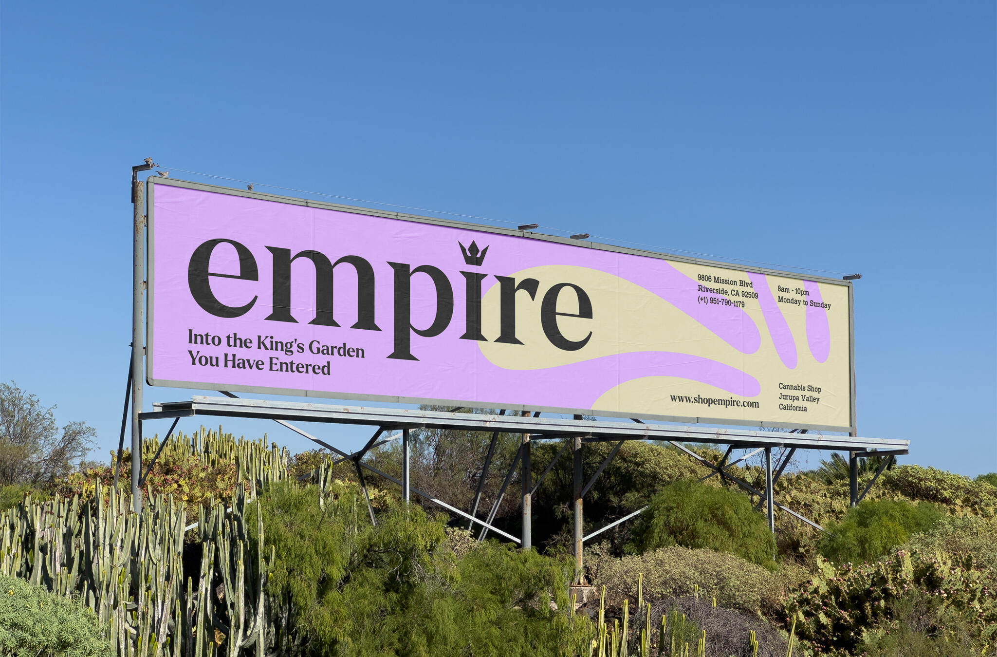
empire
Visual Identity / Design Strategy
Case Study Overview
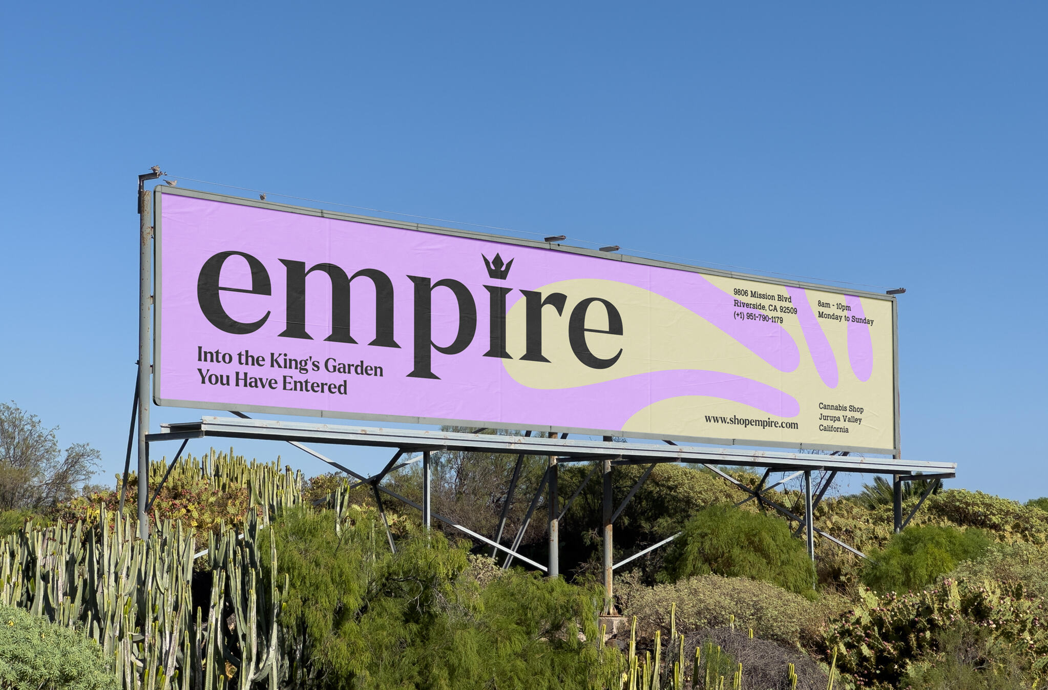
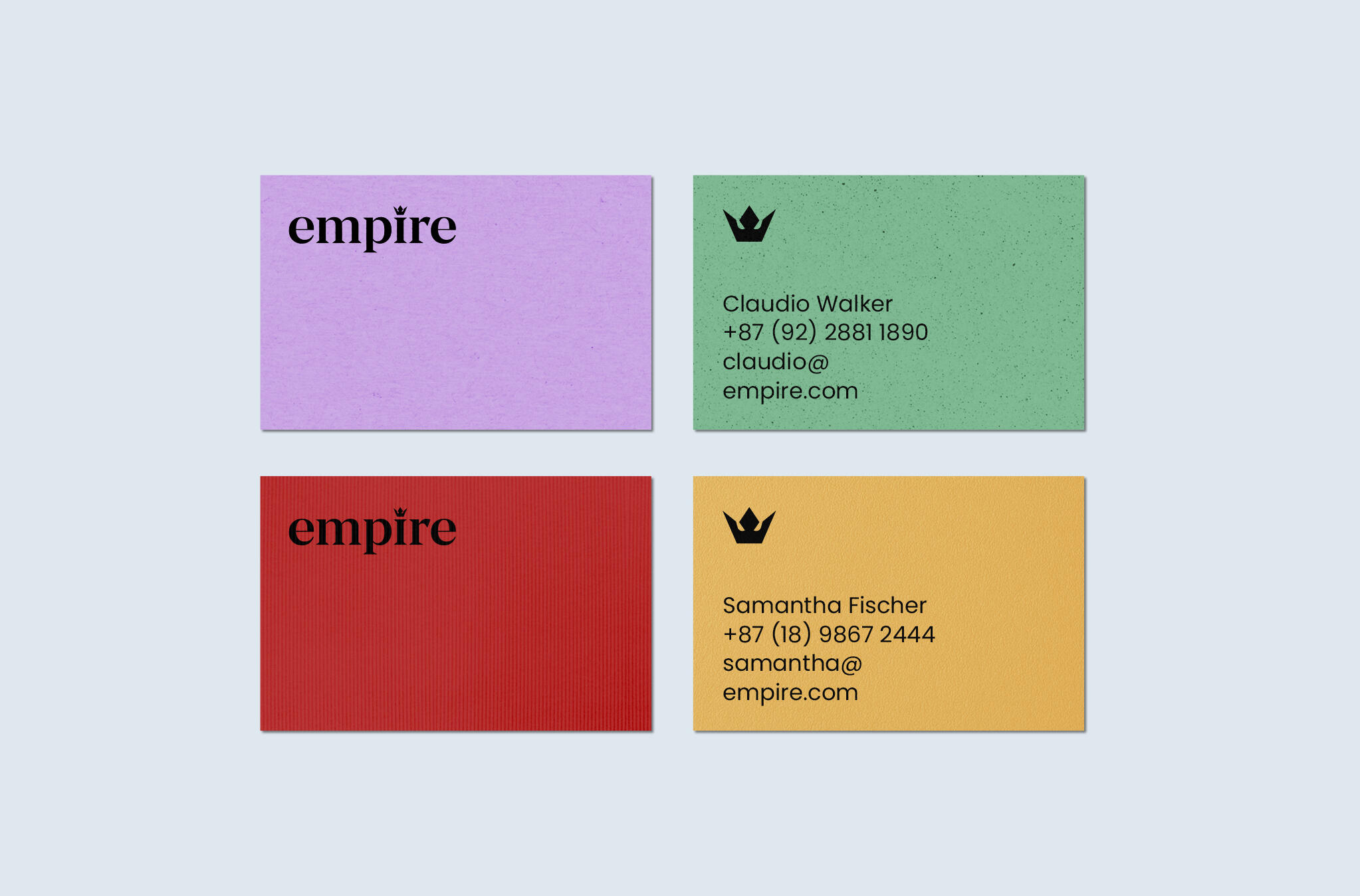
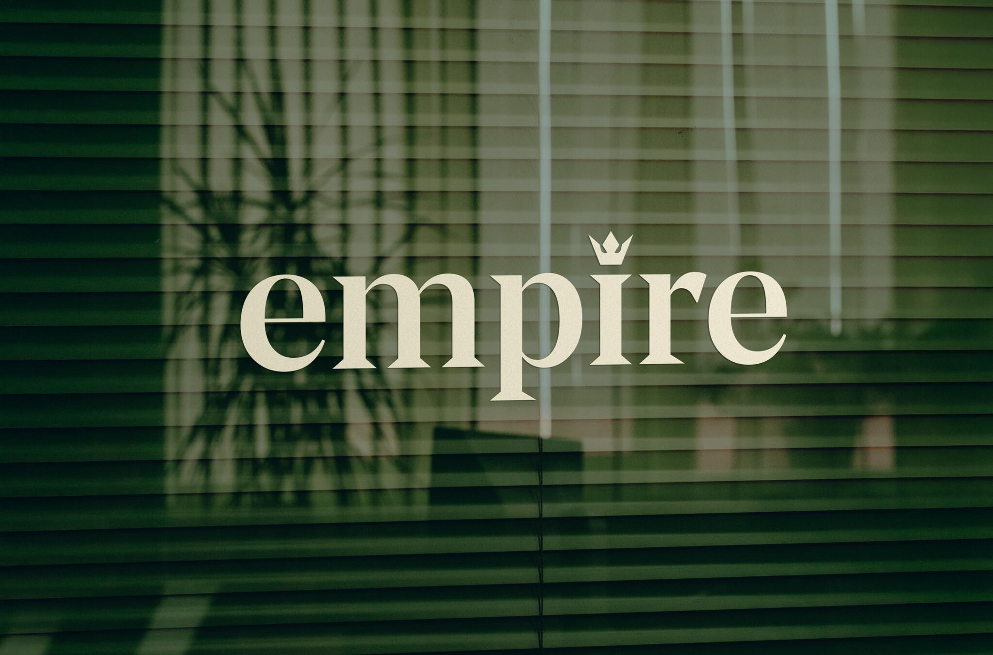
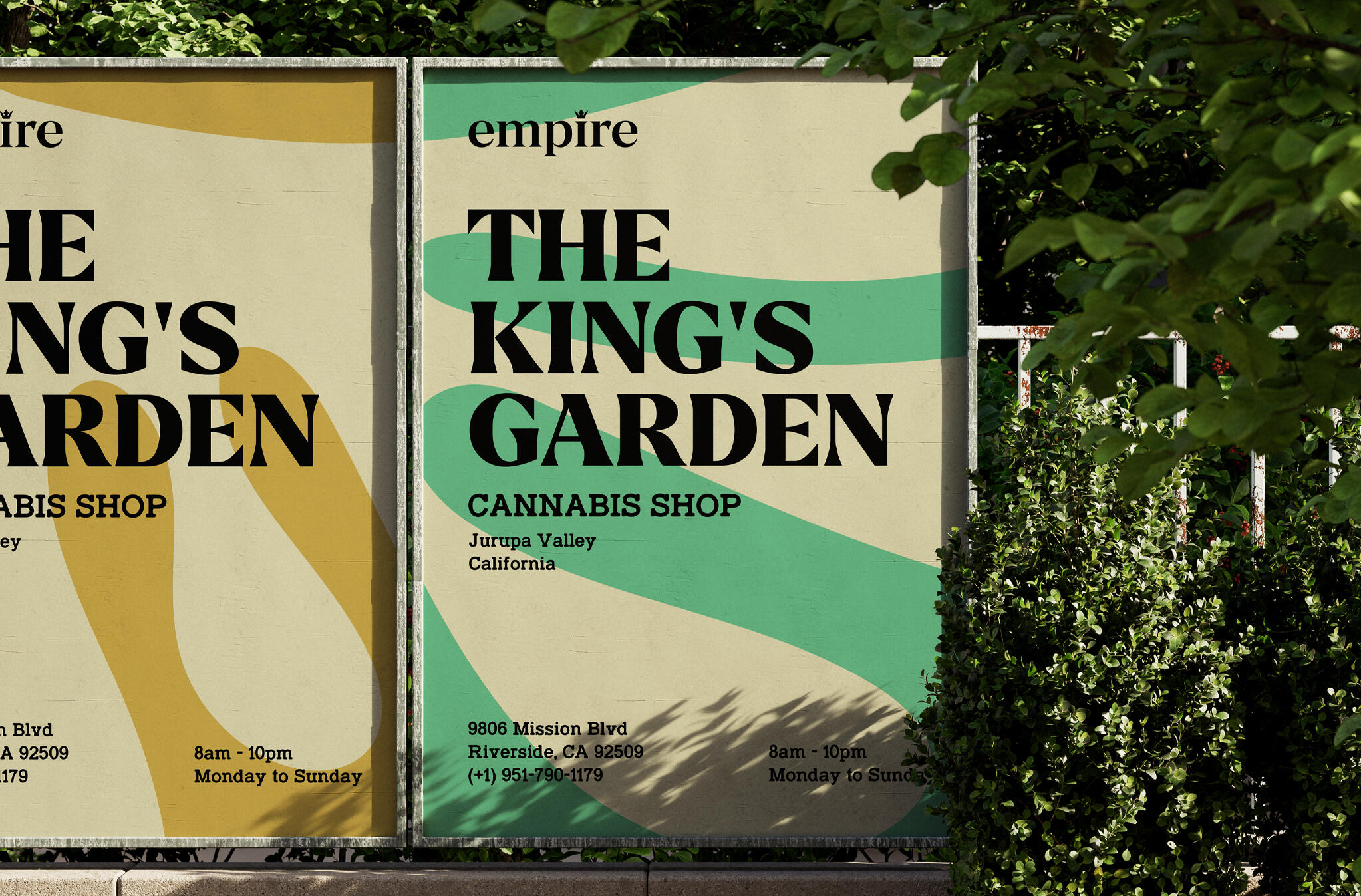
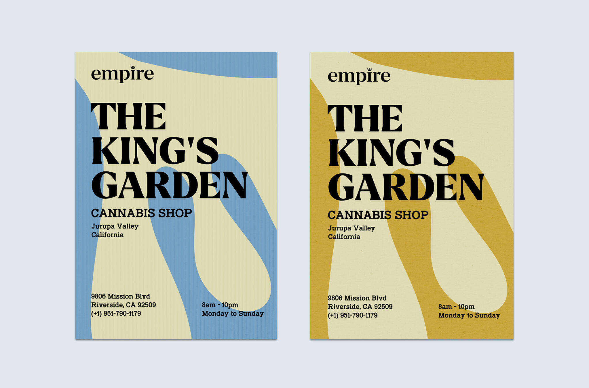
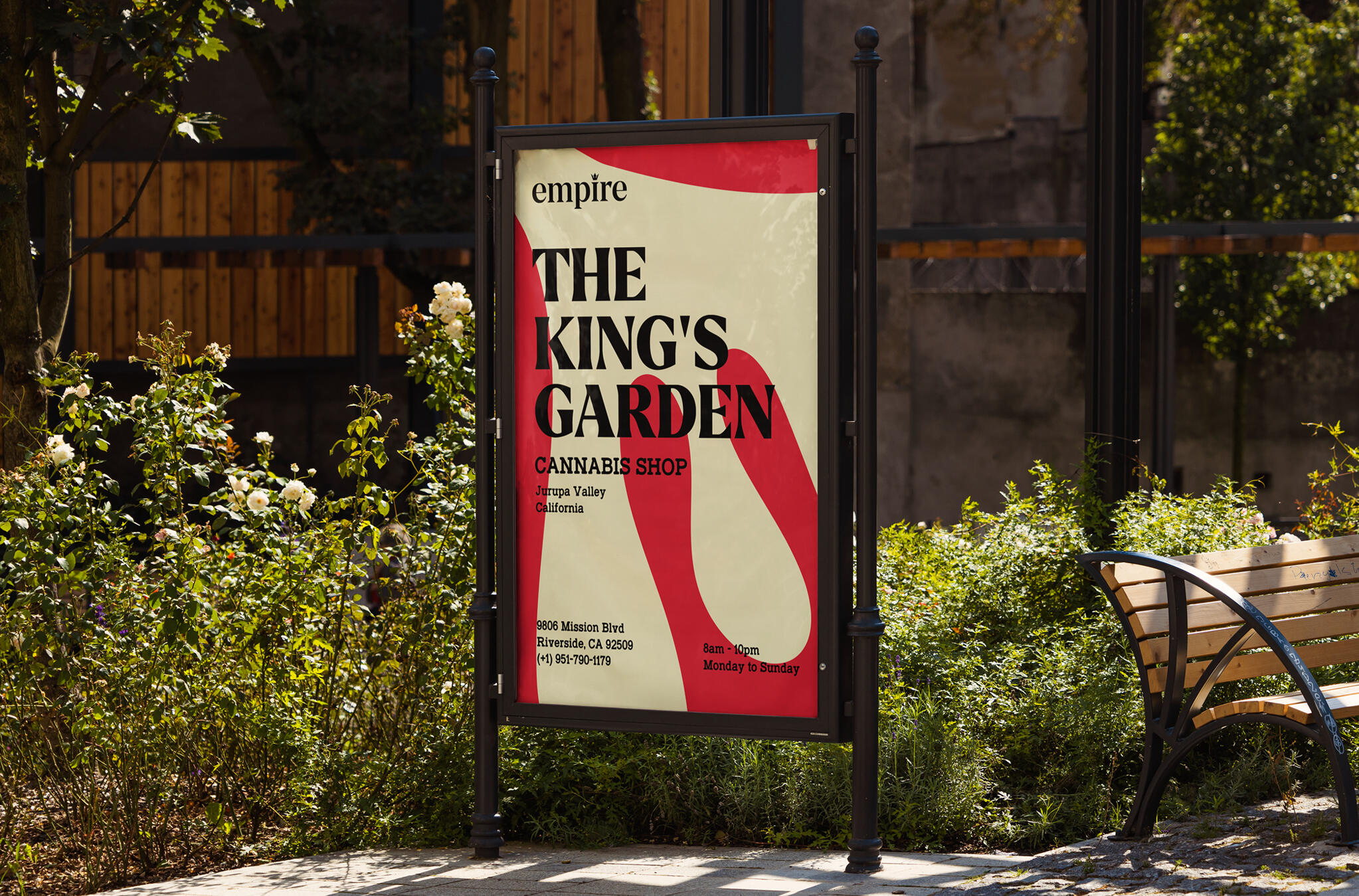
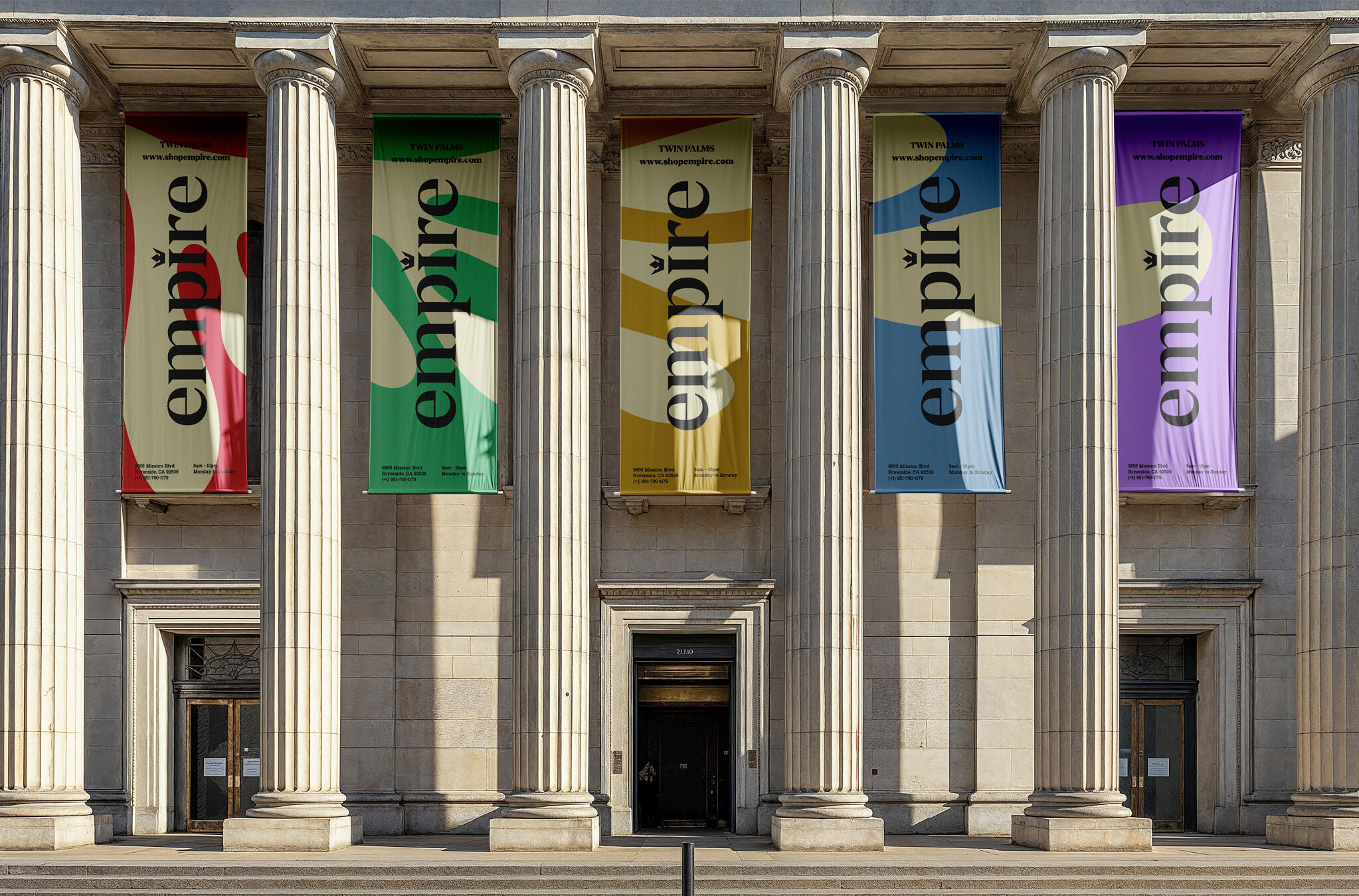
Empire is a franchise of dispensaries for those seeking balance, relaxation, and a more mindful lifestyle. Positioned as more than a conventional dispensary, the brand offers a carefully curated selection of CBD and THC products, pairing expert guidance with evidence-based knowledge to create an approachable and unique experience. Rather than conforming to the industry's familiar visual language, Empire embraces a vibrant and expressive identity that reflects the diversity of its product range and the personality behind the brand.The ChallengeThe objective was to develop a visual identity that inspires confidence at first glance while revealing a richer, more engaging brand experience across the media. The name empire evokes a sense of close-community, legacy, and heritage — qualities that form the foundation of the brand's relationship with you.The SolutionThe brand balances heritage with contemporary expression, creating a brand that feels both established and inviting. At the heart of the identity is a custom logotype featuring a simplified crown, a subtle symbol of leadership, quality, and belonging. The primary typeface, Manier, draws inspiration from classical serif typography, lending the brand an editorial elegance while reinforcing its connection to history and craftsmanship.The identity system extends across a wide range of print and advertising media, including posters, billboards, packaging, and infographics. Each rendition contributes to a cohesive brand experience that communicates empire's philosophy through bold visuals, expressive layouts, and an unmistakable sense of colorful optimism. The result is a brand that transforms the dispensary experience into something more welcoming, engaging, and culturally relevant.The ImpactDeparting from the muted greens and earthy tones commonly associated with the CBD industry, the color palette introduces vivid, energetic hues inspired by the rich variety of strains available across empire's product selection. This expressive use of color reinforces the brand's belief that exploration should be as enjoyable as the products themselves, creating a visual identity that is memorable and contemporary.
CellX
Design Strategy / Package Design
Case Study Overview
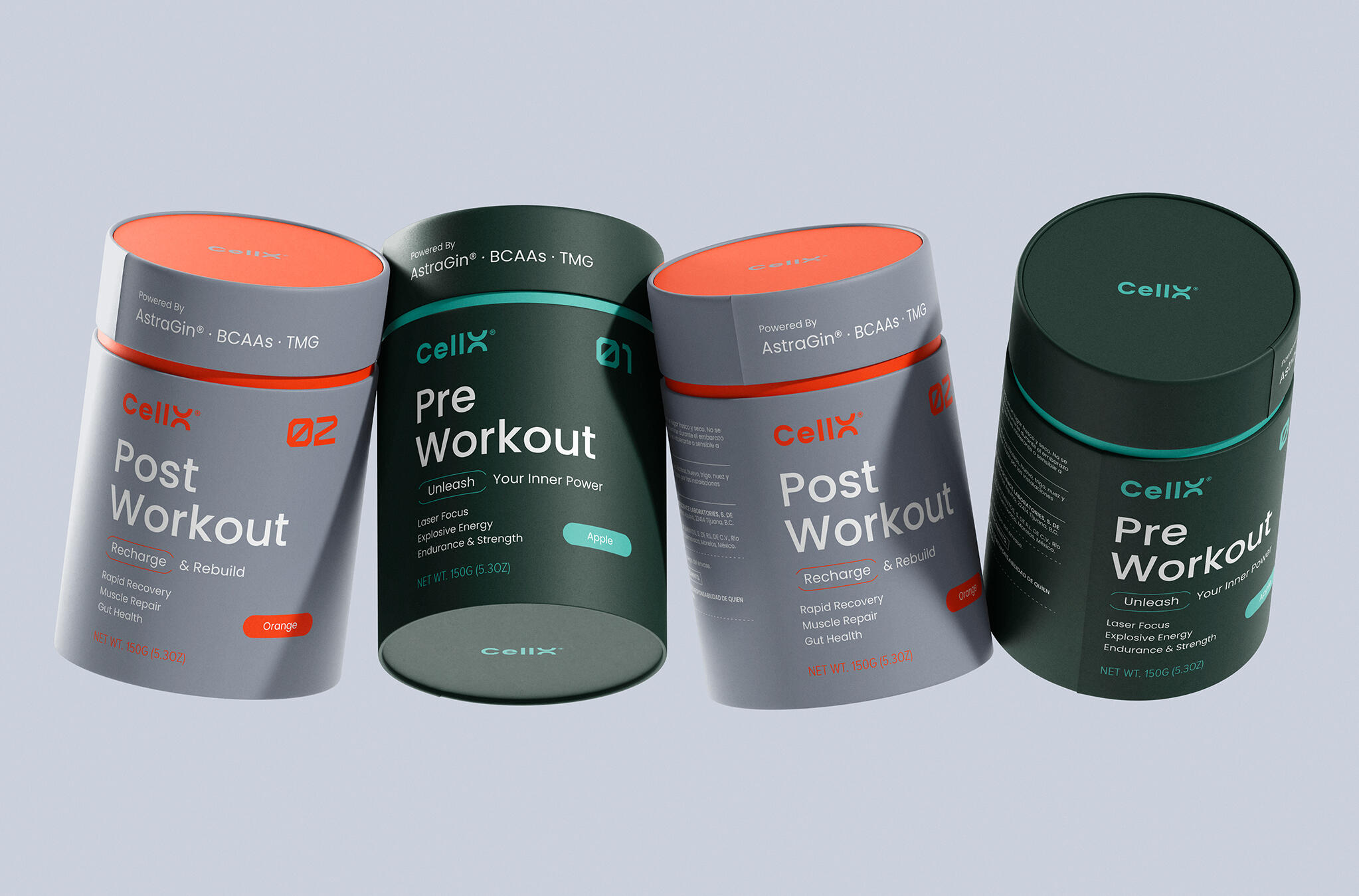
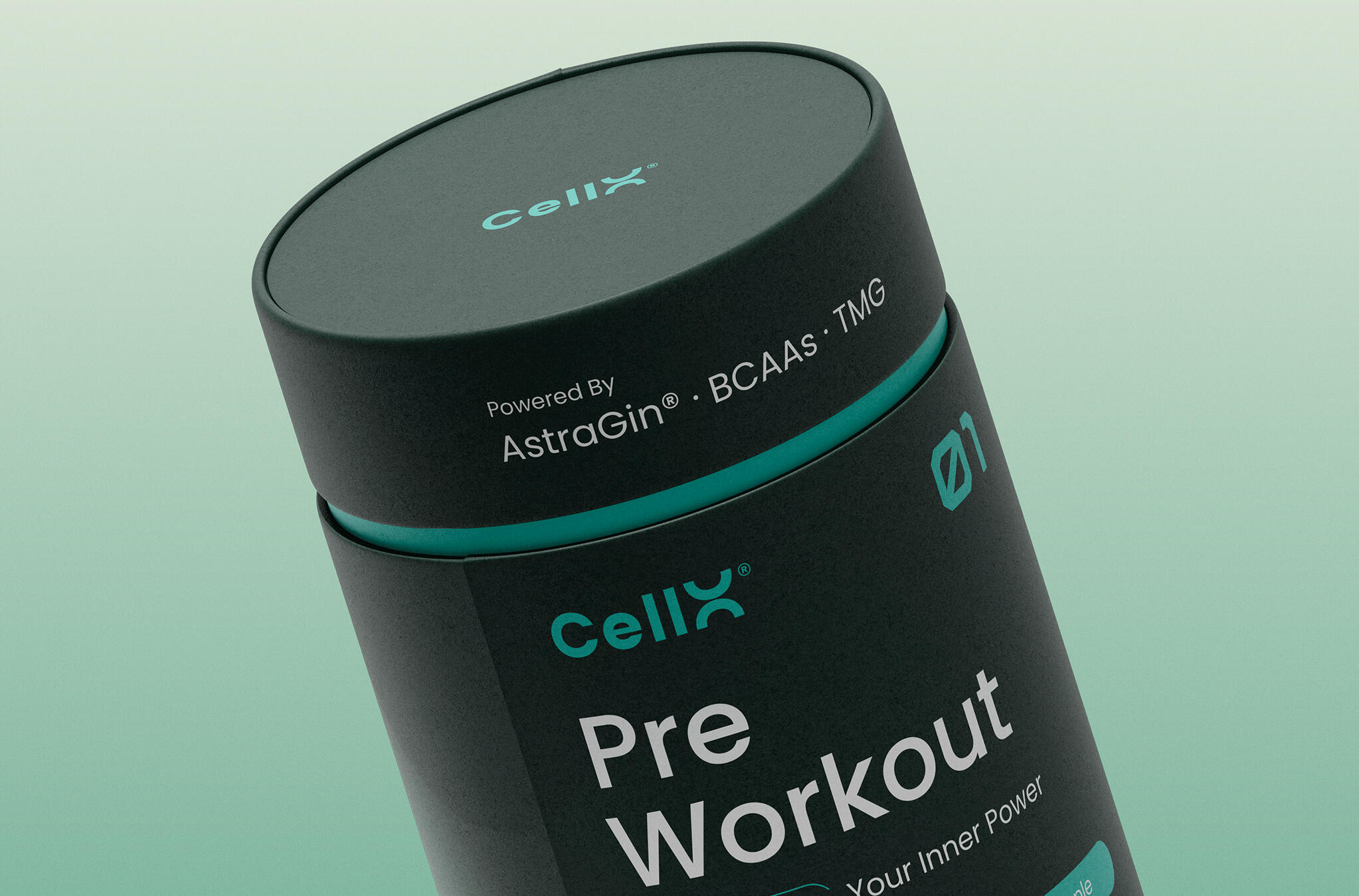
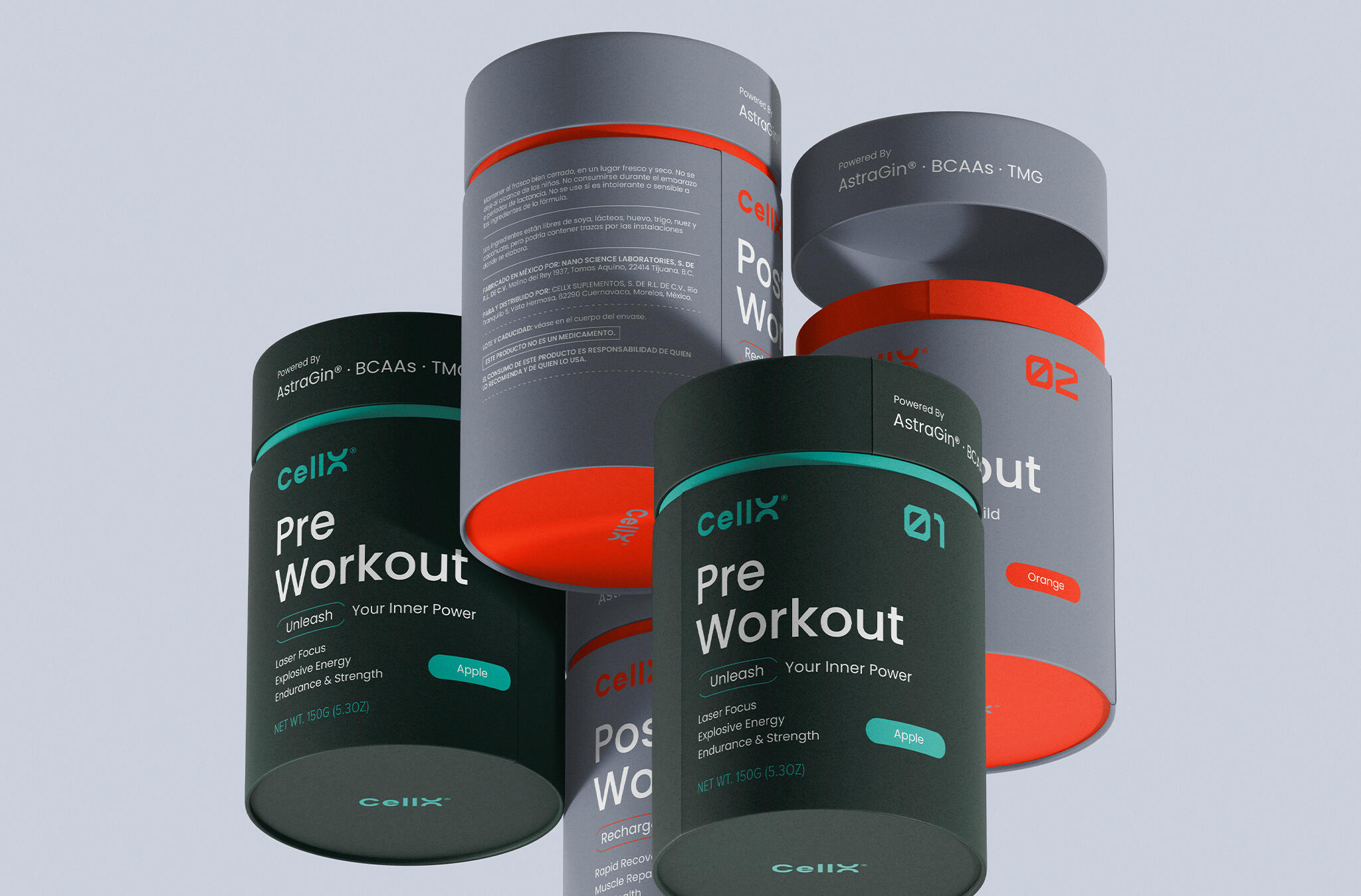
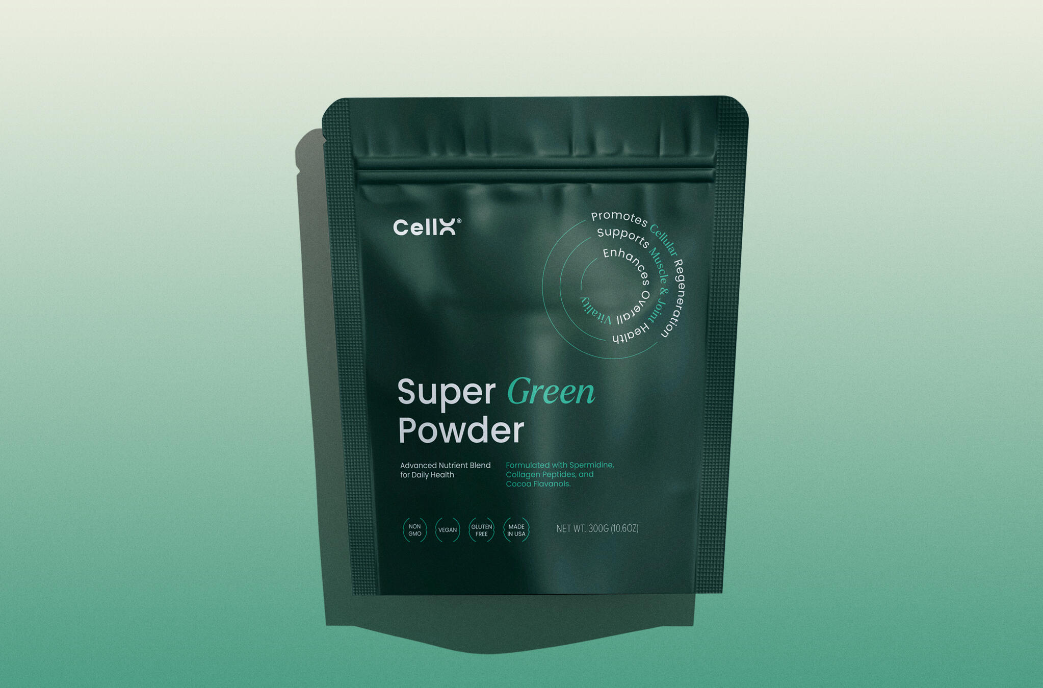
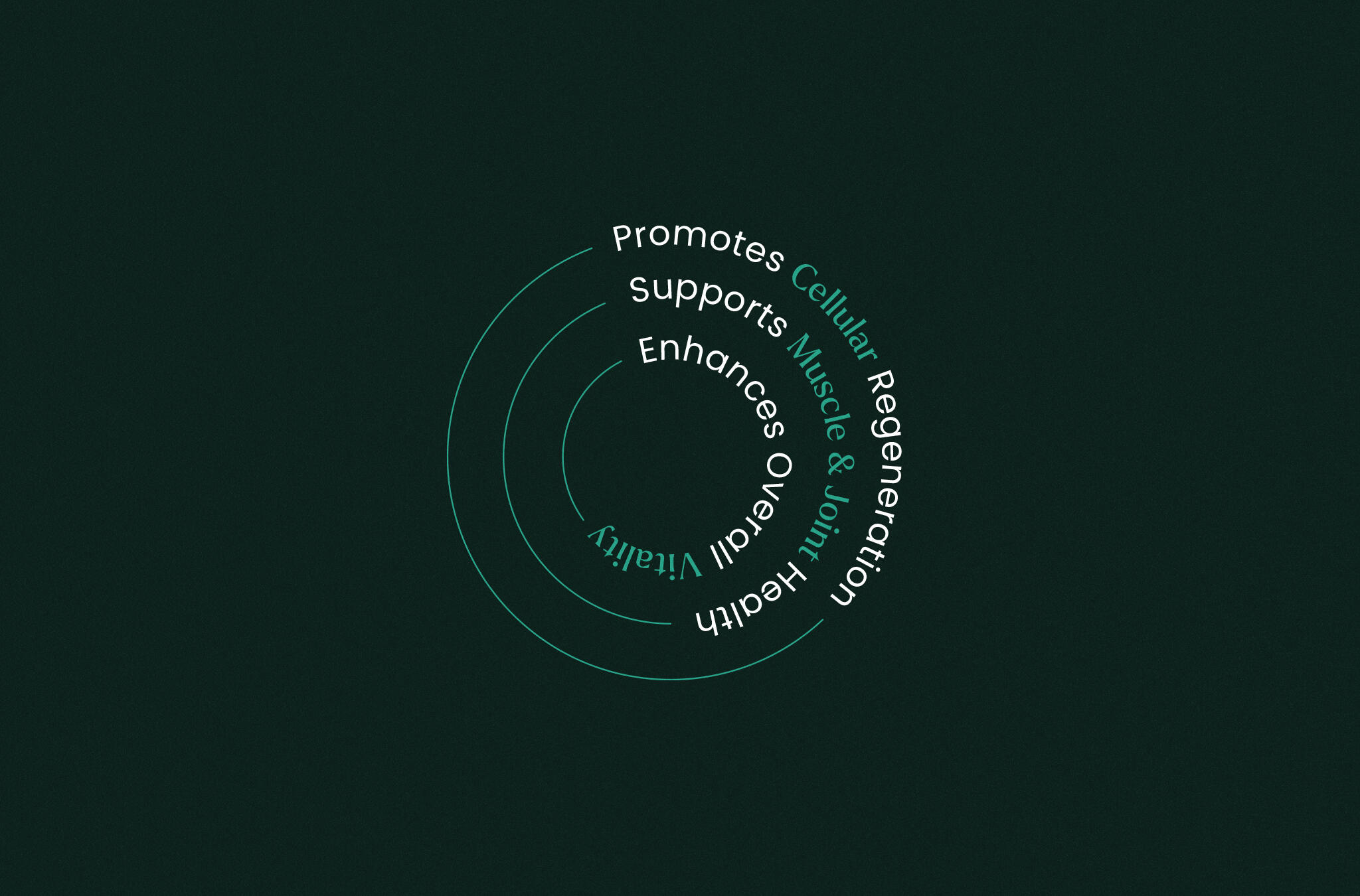
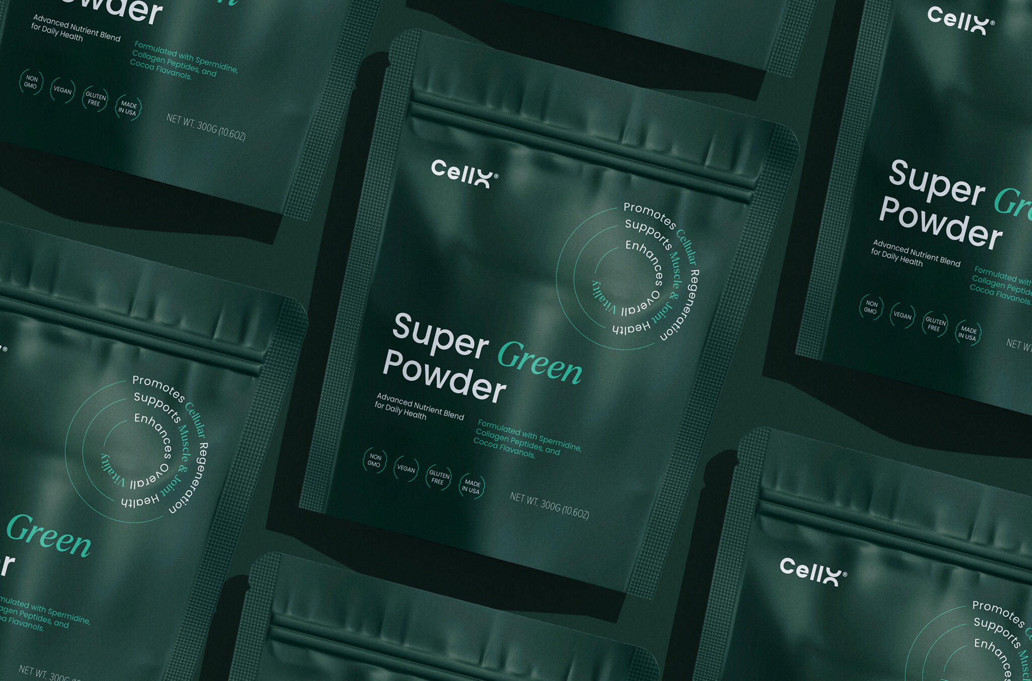
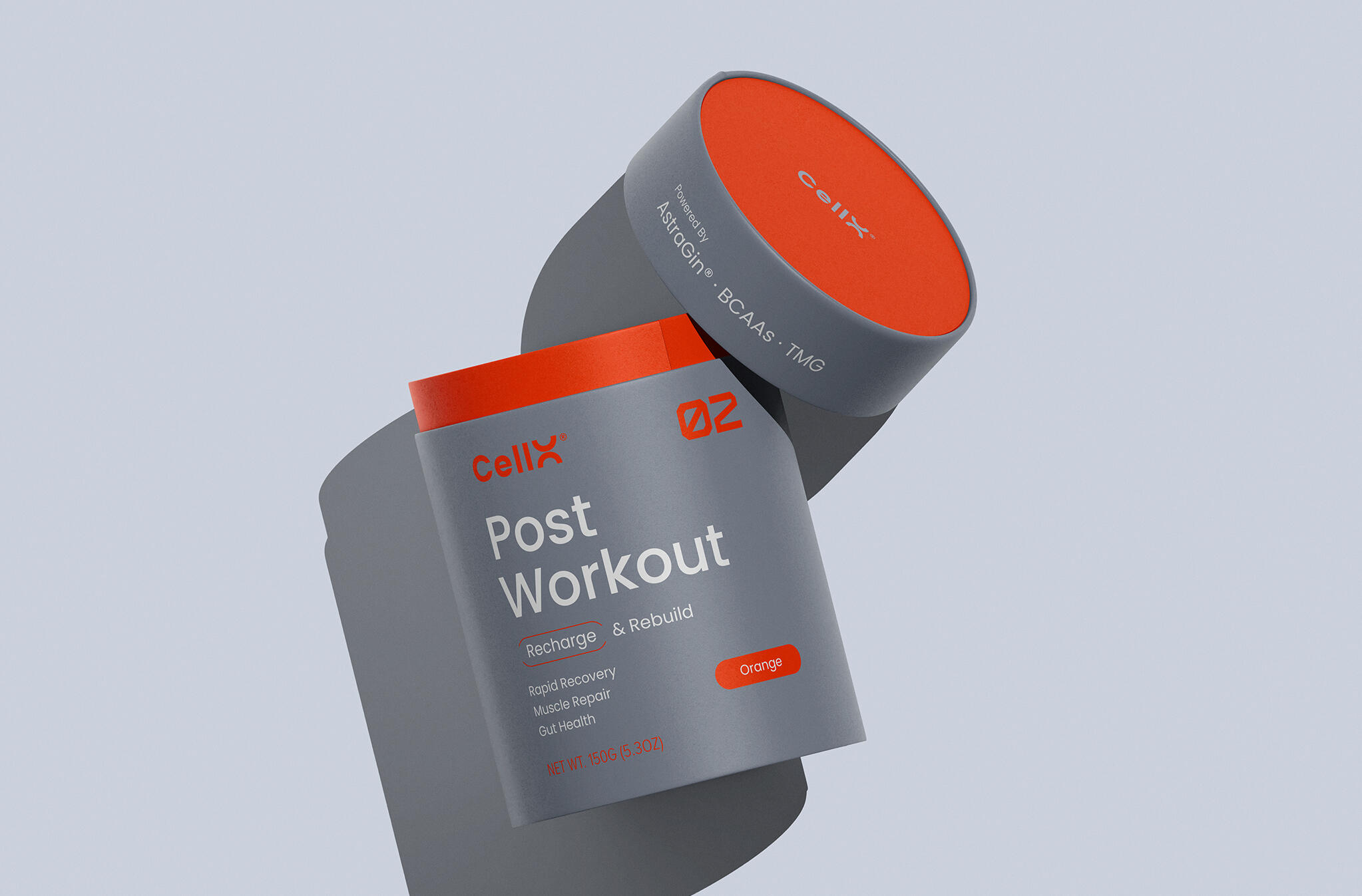
Driven by science, CellX brings state-of-the-art supplements to support your everyday activities.The packaging design uses typography as its primary form of communication with customers. Color coding distinguishes each flavor while reflecting the tone of the powder contained inside the packaging.The overall brand aesthetic is inspired by scientific research and evidence, reflecting CellX's commitment to developing products backed by science.
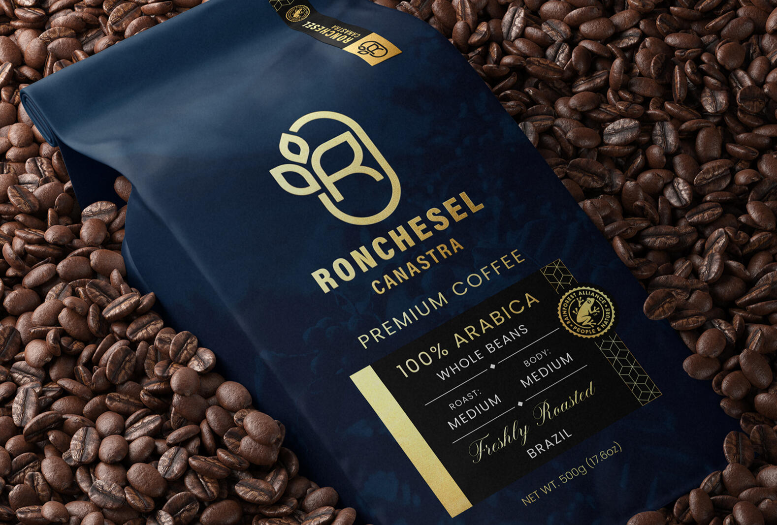
Ronchesel Canastra
Visual Identity / Design Strategy / Package Design
Case Study Overview
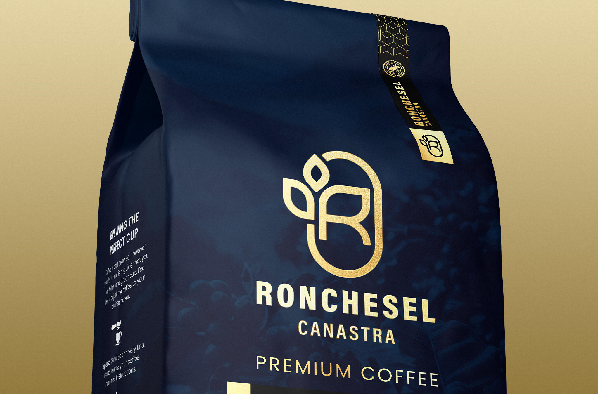
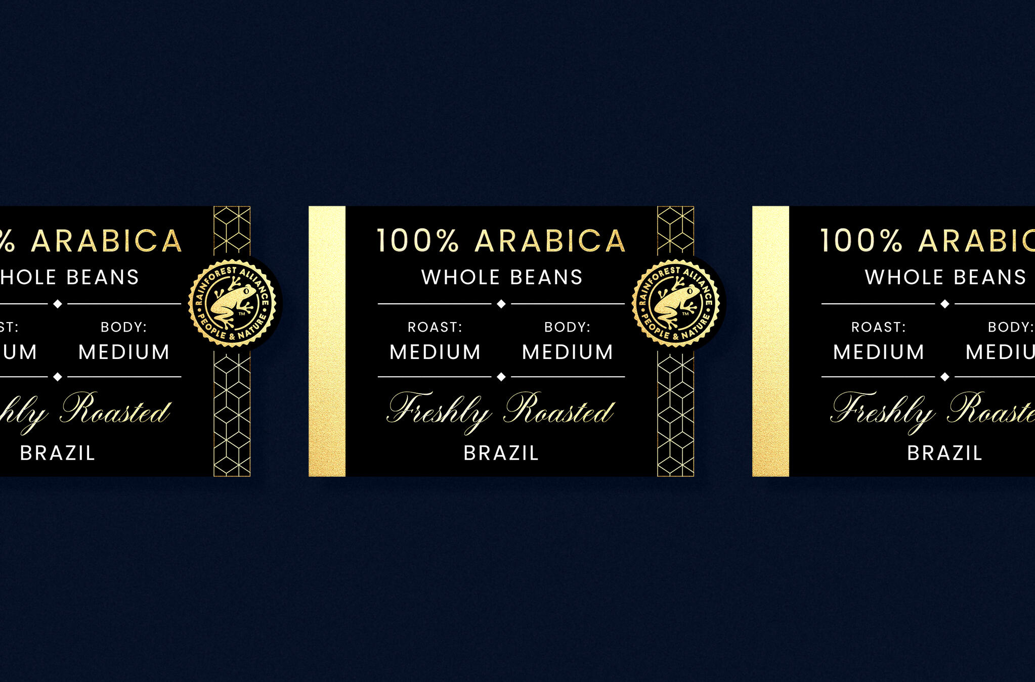
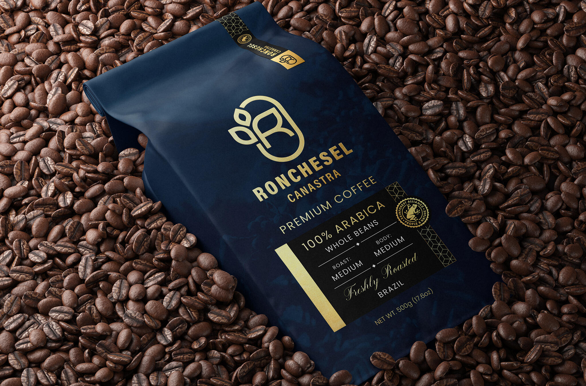
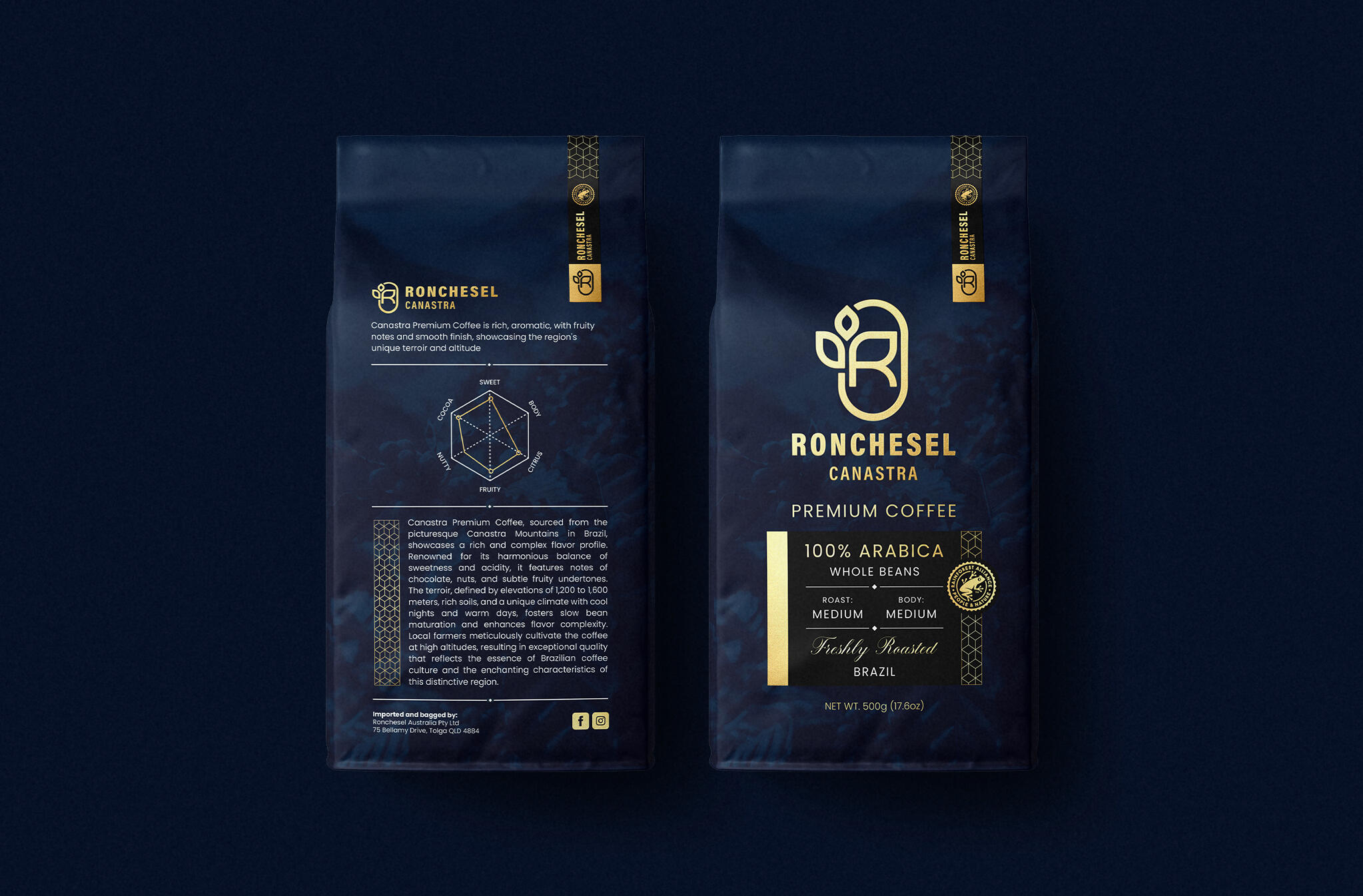
Ronchesel Coffee represents the luxury of enjoying the finest coffee beans, carefully sourced and delivered to you wherever you choose to indulge in your perfect cup.The Ronchesel brand identity incorporates the silhouette of a coffee bean paired with the plant's leaves, symbolizing the natural origin and 100% pure origin of the coffee beans.The packaging extends this visual story through a refined, minimalist aesthetic enriched with subtle luxurious details.
Every element is thoughtfully designed to emphasize the purity, craftsmanship, and exceptional care that define Ronchesel's coffee production process.
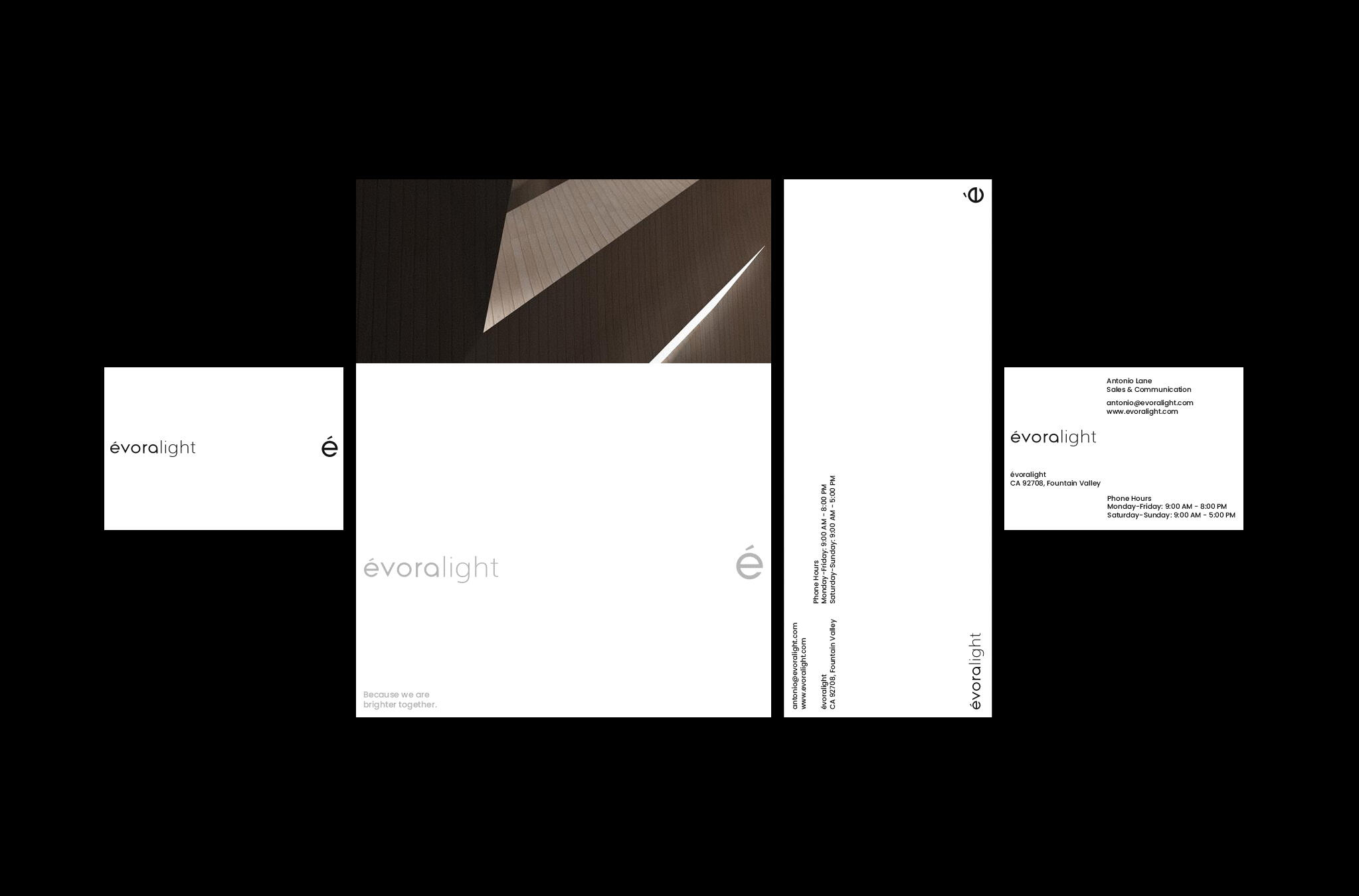
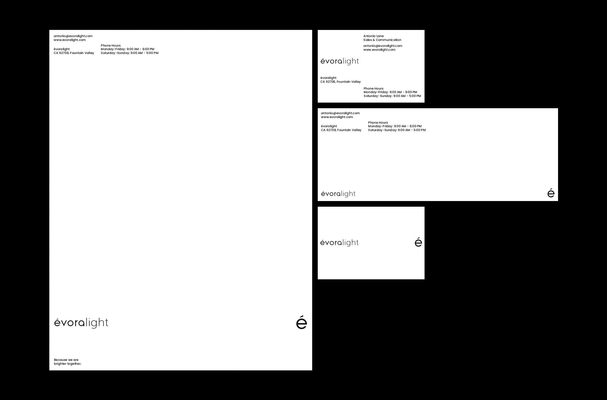
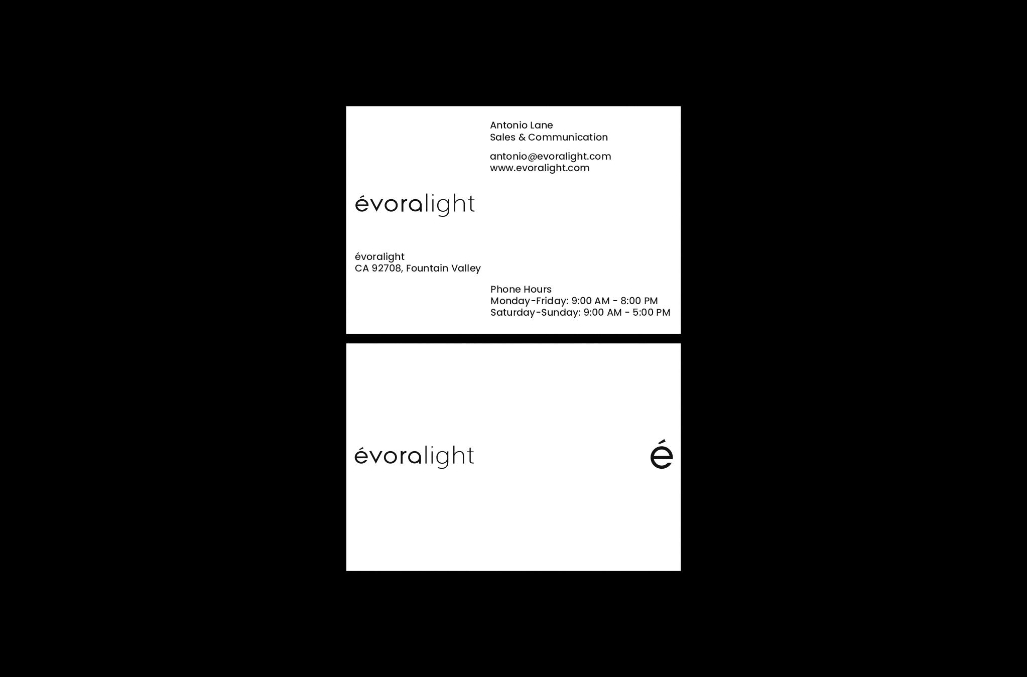
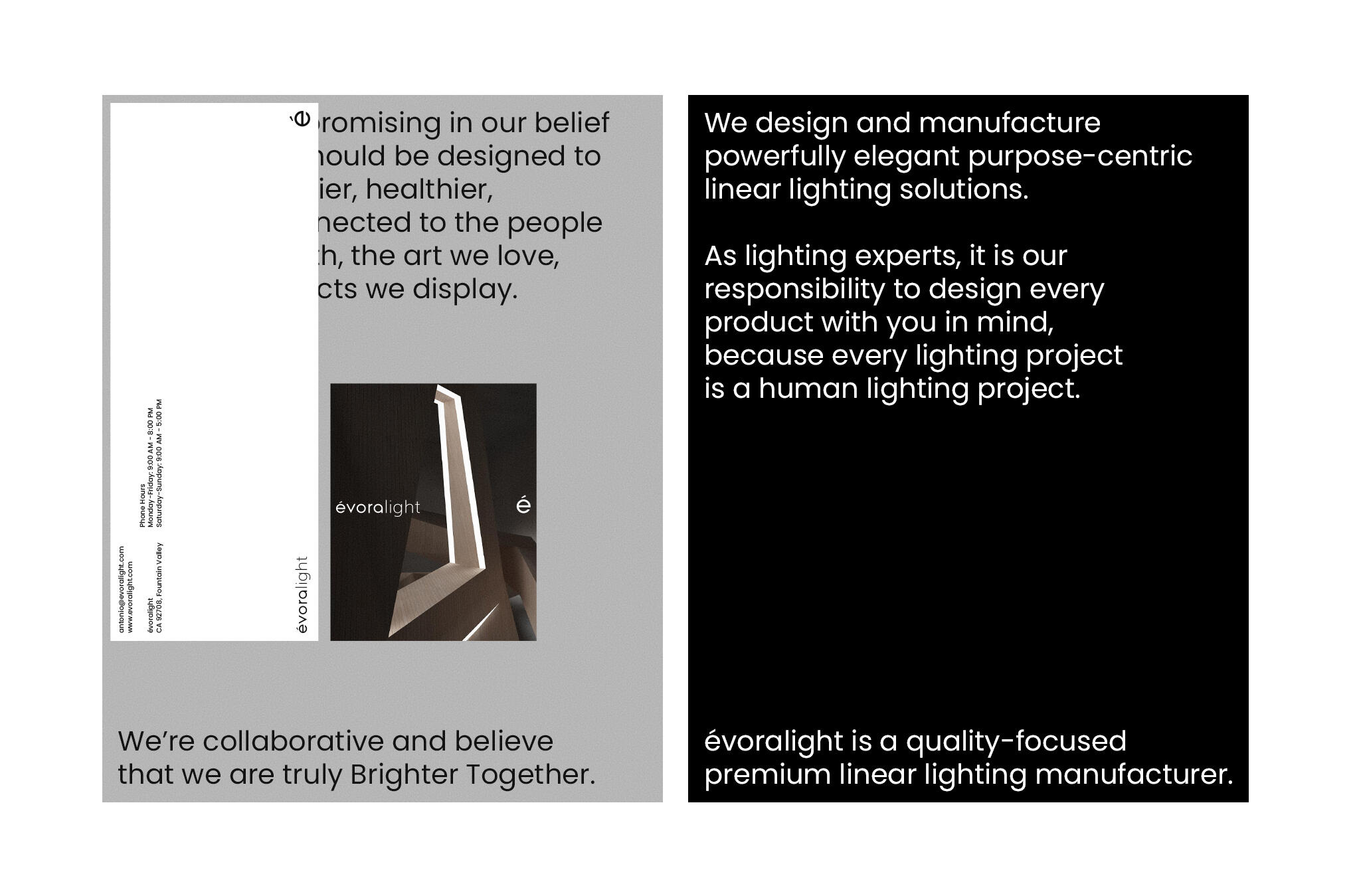
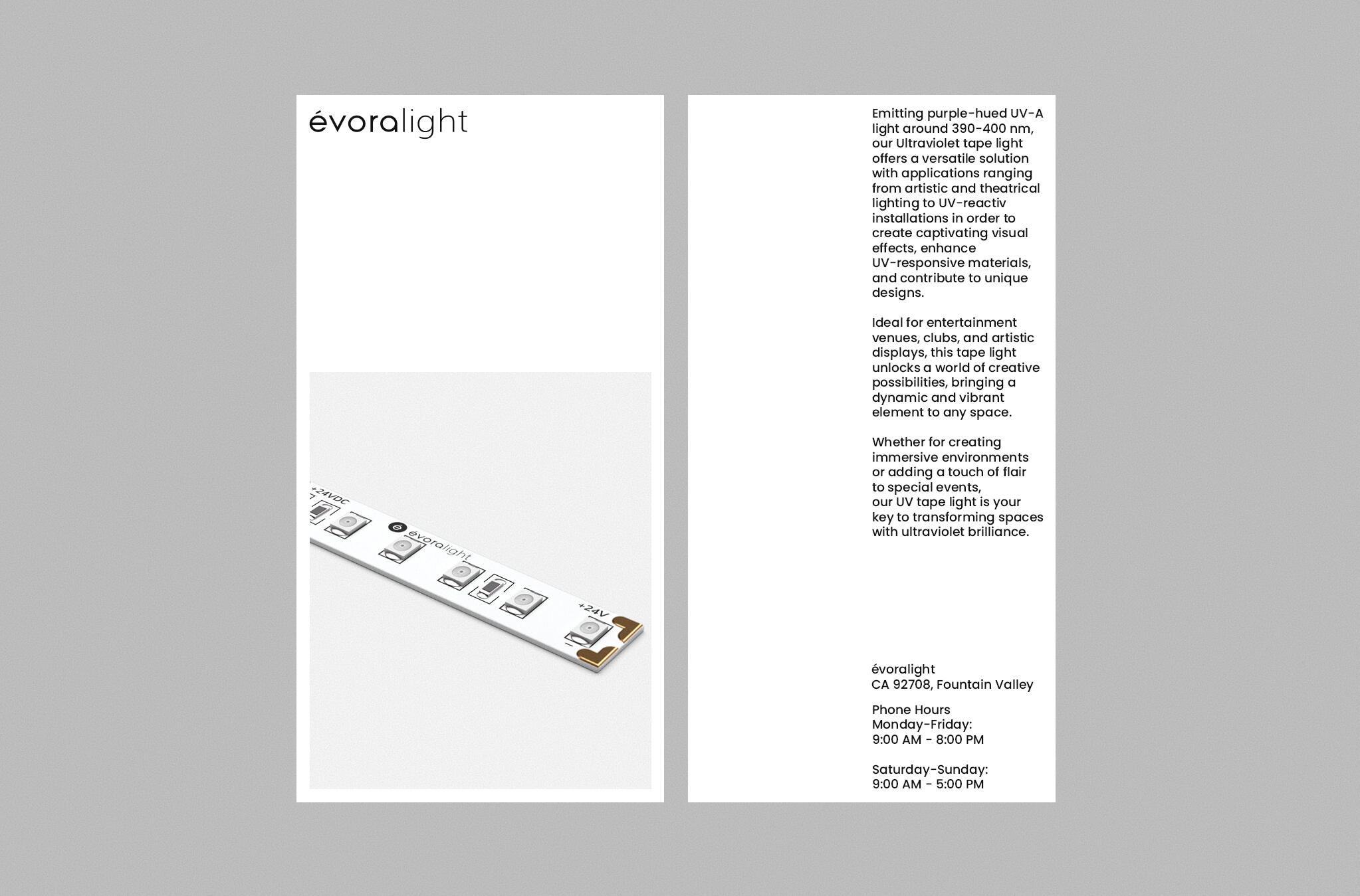
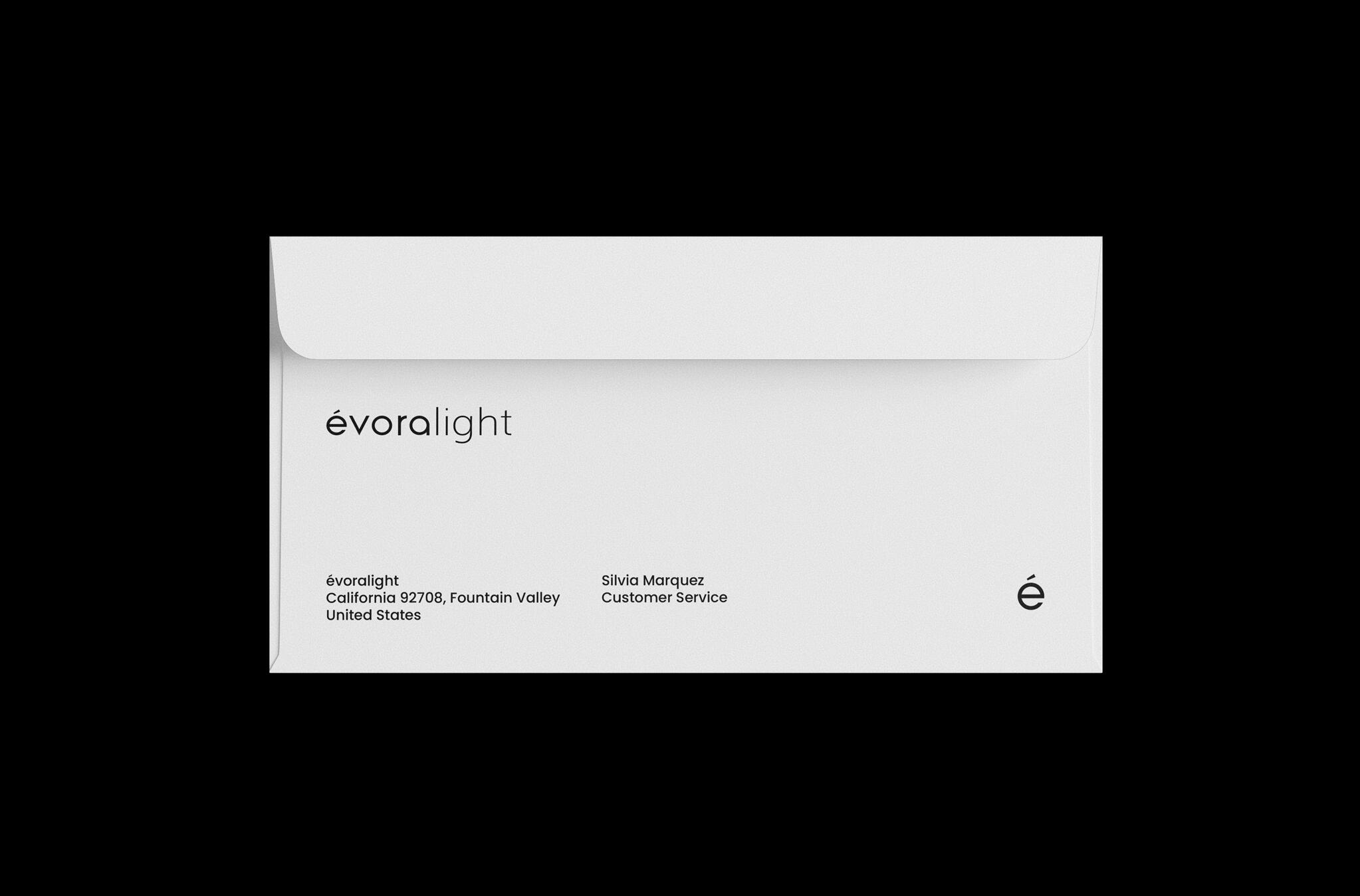
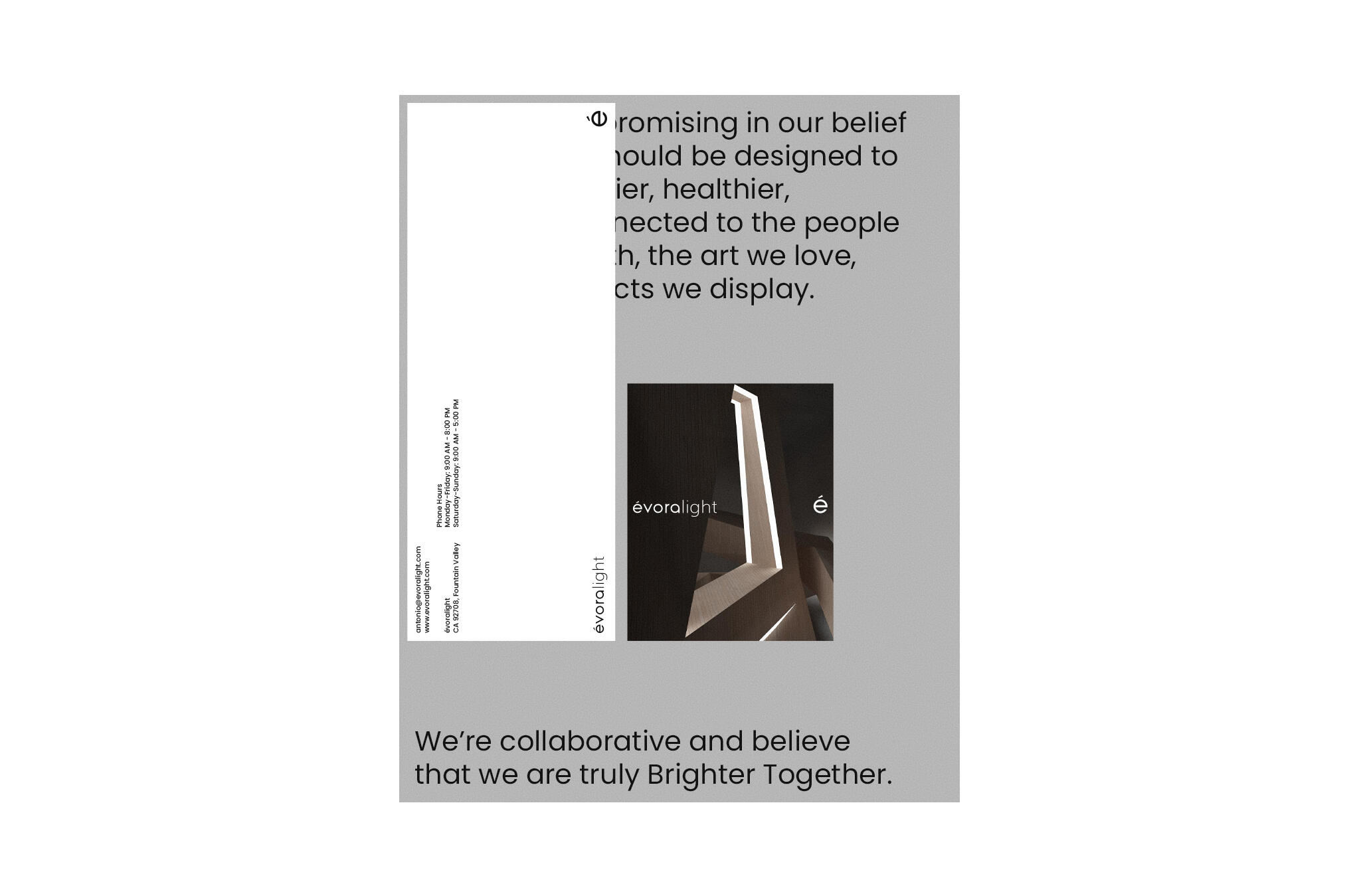
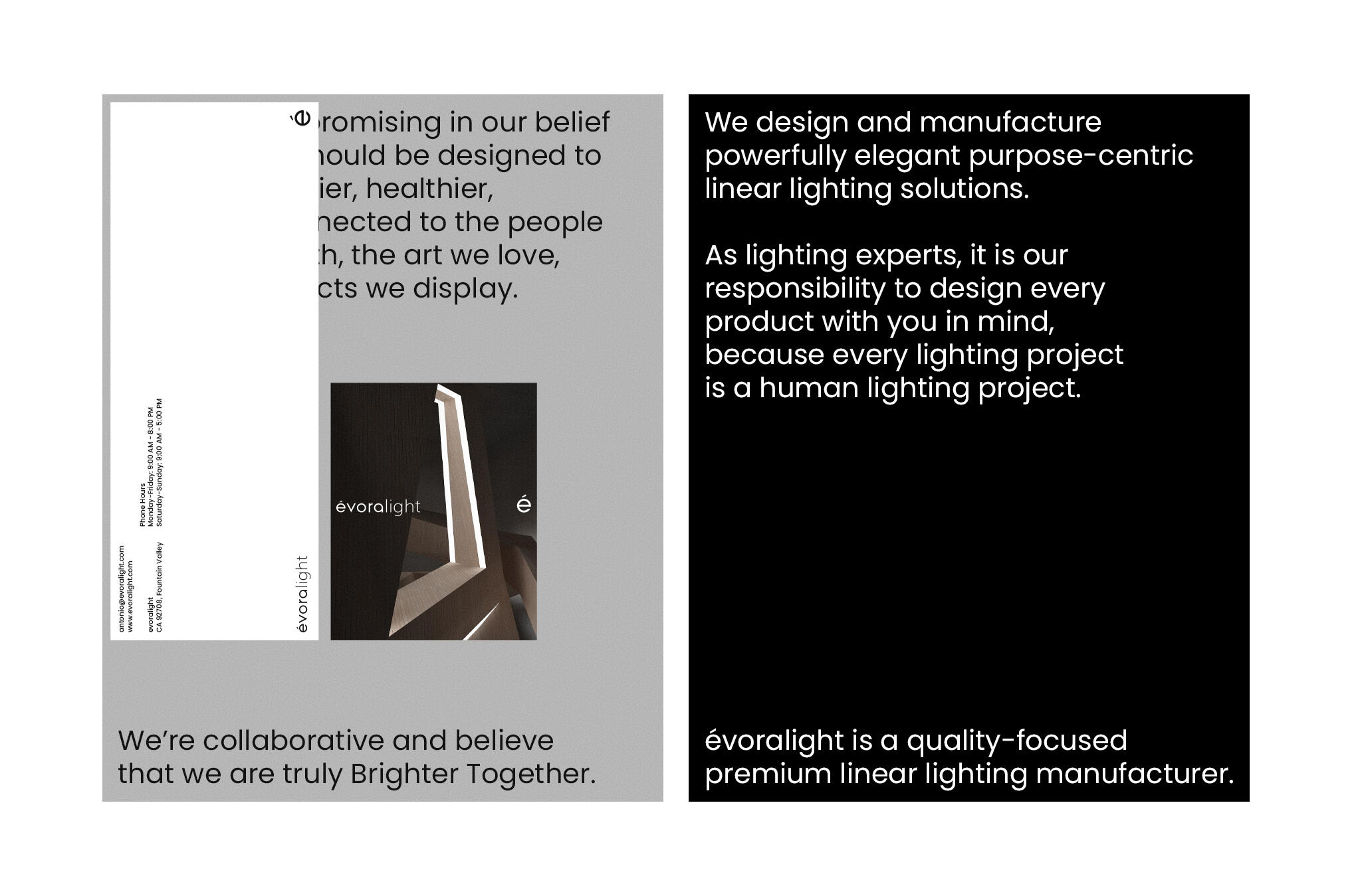
évoralight
Visual Identity / Design Strategy / Package Design
Case Study Overview
évoralight is a pioneer in the design and production of premium LED lighting solutions for both interior and exterior spaces.The brand identity is built around the timeless contrast between darkness and light. This concept is expressed through the interplay of bold and lightweight typography, creating a simple yet distinctive visual language.By relying solely on typography, the identity communicates évoralight's commitment to sophisticated aesthetics, innovation, and contemporary lighting design, reflecting the brand's ability to transform spaces
through light.